16 Content Accessibility
Digital Accessibility[1]
Digital accessibility refers to the ability of people with disabilities/impairments to independently consume and/or interact with digital (e.g., web, mobile) applications and content.
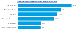
According to WebAIM Million Report, the following shows the Causes of Most Common Accessibility Failures (% of Home Pages):

Missing Image Alt Text 66%
Empty Links 59.9%
Missing Form Input Labels, 53.8%
Empty Buttons, 28.7%
Missing Document Language, 28%
Checklist to ensure content meets common accessibility standards:
Documents
☐ Content is organized under headings and subheadings.
☐ Headings and subheadings are used sequentially (e.g., Heading 1, Heading 2).
☐ Reading order is accurate for PDF documents.
☐ Font size is 12 point or higher for body text in Word and PDF documents.
Video
☐ All audio content includes a transcript. The transcript includes all speech content and relevant descriptions of non-speech audio and speaker names/headings where necessary.
☐ Videos have captions of all speech content and relevant non-speech content that has been edited by a human for accuracy.
☐ All videos with contextual visuals (graphs, charts, etc.) are described audibly in the video.
Images
☐ Images that convey information include alternative text (alt text) descriptions of the image’s content or function.
☐ Graphs, charts, and maps also include contextual or supporting details in the text surrounding the image.
☐ Images do not rely on color to convey information.
☐ Images that are purely decorative do not have alt text descriptions. (Descriptive text is unnecessary if the image doesn’t convey contextual content information).
Infographics
☐ Font size is readable and sentences are short.
☐ Icons or illustrations that convey information include alternative text (alt text) descriptions of the their content or function.
☐ Color contrast between the foreground content and background content is acceptable. When in doubt, use WebAIM’s Color Contrast Checker. When the foreground and background colors are too similar, users will have a hard time understanding the information.
☐ The width of the Infographic is around 640 pixels. Mobile devices that can’t easily display infographics that are too wide.
See also: WebAIM Infographic Accessibility for Designers
Slidedecks
☐ Every slide has a title.
☐ Every slide uses a slide layout that supports its content (ie, title slide, title+content, etc.)
☐ Edit the slide master to add placeholders for text boxes or content rather than inserting directly into slides.
☐ Headings and subheadings are used sequentially (e.g., Heading 1, Heading 2).
☐ Font size is at least 20 point for legibility.
☐ Amount of text used on slides is minimal.
Additional Resources:
Accessibility Toolkit from BC Campus.
Licenses and Attributions
“Accessible Course Media Development” by Veronica Vold for Open Oregon Educational Resources is licensed CC BY and adapted in part from “Appendix A: Checklist for Accessibility” by Amanda Coolidge, Sue Doner, Tara Robertson, and Josie Gray for BCcampus licensed CC BY.
- https://accessibility.day/ ↵
