5. Magnitude and Intensity
Earthquakes are measured and described in two ways. They can be discussed in terms of their size, or magnitude, which reflects the amount of energy released by the shaking. They can also be described in terms of intensity, which characterizes the impact of the shaking on people and their surroundings.
A single earthquake has one magnitude value, but the shaking from it can result in a range of intensities across an area.
5.1 Earthquake Magnitude
Many people have heard of the Richter Scale (named for Charles F. Richter, a seismologist at California Institute of Technology) for measuring earthquake magnitude, but in practice this scale is not used anymore except for small local earthquake measurements. The Richter Scale determines magnitude by measuring the amplitude of S-waves on a seismogram and then correcting this for distance (Figure 1B.5.1).
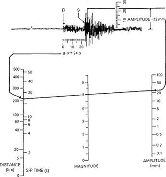
This was the principle that Richter used to create his scale; however, this scale was developed based on California earthquakes, which occur along the San Andreas Fault and are therefore all shallow focus. The Richter scale is not as accurate when measuring earthquakes that have happened at distances farther away than about 600km or ones that occur at greater depths.
While news reports about earthquakes might still refer to the “Richter scale” when describing magnitudes, the number they report is the moment magnitude. In addition to making seismic wave amplitude measurements (albeit slightly different ones than the Richter scale uses), the moment magnitude considers the surface area of the region that ruptured, how much displacement occurred, and the stiffness of the rocks. Moment magnitude can capture the difference between short earthquakes and longer ones resulting from larger ruptures, even if both types of earthquakes generate the same amplitude of waves. The moment magnitude scale is also better for earthquakes that are far from the seismic station.
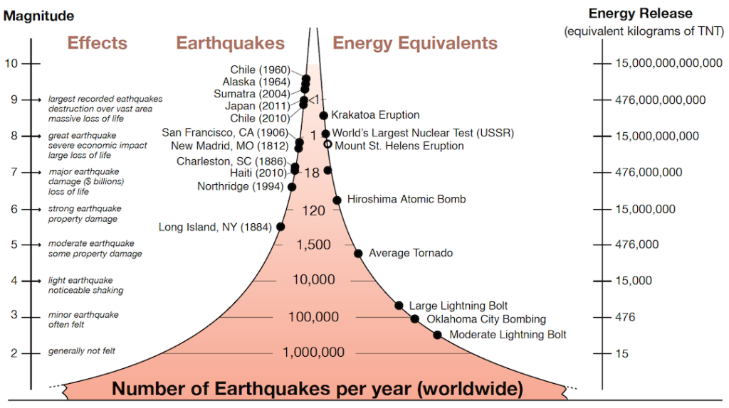
The magnitude scale is a logarithmic one rather than a linear one. An increase of one unit of magnitude corresponds to a release of energy that is 32 times greater (Figure 1B.5.2). There are far more low-magnitude earthquakes than high-magnitude earthquakes. For example, in 2017 there were 7 earthquakes of M7 (magnitude 7) or greater, but millions of tiny earthquakes.
5.2 Earthquake Intensity
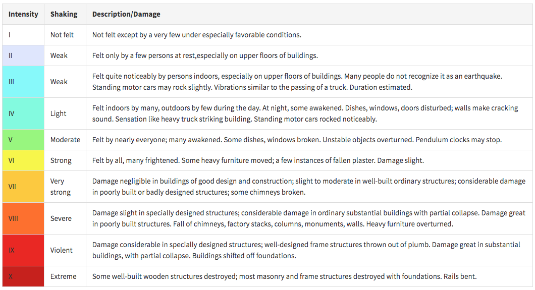
Intensity scales were first used in the late 19th century, and then adapted in the early 20th century by Giuseppe Mercalli and modified later by others to form what we now call the Modified Mercalli Intensity Scale (Figure 1B.5.3). To determine the intensity of an earthquake, reports are collected about what people felt and how much damage was done. The reports are then used to assign intensity ratings to regions where the earthquake was felt. On the United State Geological Survey (USGS) website, you can look up information about all earthquakes on the planet and report if you felt shaking from it, where you were located when you felt the shaking, and how strong the shaking was.
Intensity values are assigned to locations, rather than to the earthquake itself. This means that intensity can vary for a given earthquake, depending on the proximity to the epicenter and local conditions.
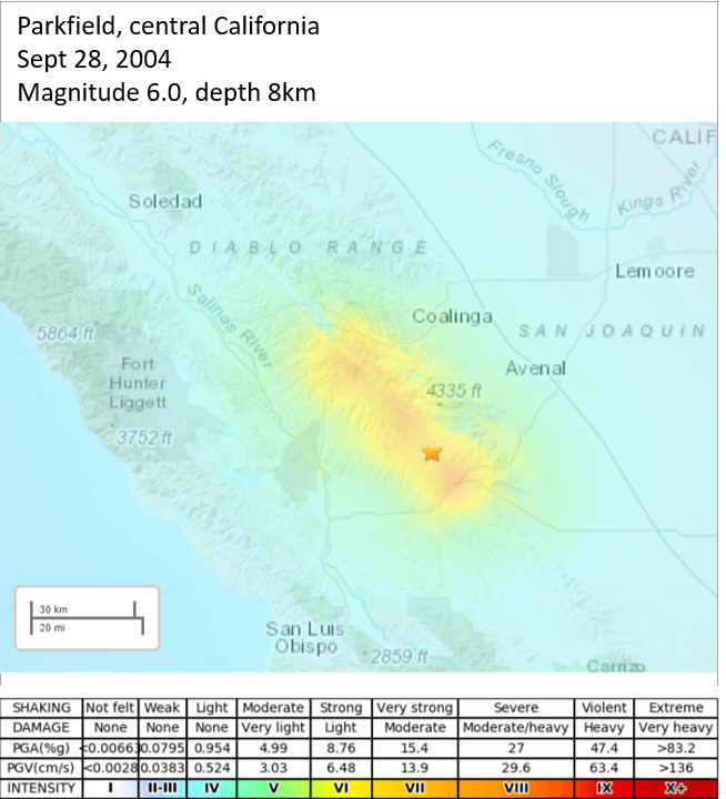
The intensity map for the 2004 M6.0 earthquake in Parkfield, California is shown in Figure 1B.5.4. This earthquake was a result of slip along the San Andreas Fault (see the Box on the San Andreas Fault System below for more information about the larger network of faults in this area). On this intensity map, the star is the earthquake epicenter. The map colors correspond to the colors on the intensity table above (Figure 1B.5.3). The intensity is strongest, level VIII (severe shaking) with some very small areas that may be IX (violent shaking), closest to the epicenter as well as along a zone extending 40km (~30 miles) northwest of the epicenter in the general trend of the San Andreas Fault. Farther away than this the intensity decreases steadily in all directions.
Intensity maps can be used to identify regions that are especially prone to strong shaking. A key factor is the nature of the underlying geological materials. The weaker the underlying materials, the more likely it is that there will be strong shaking. Areas underlain by strong solid bedrock tend to experience far less severe shaking than those underlain by unconsolidated sediments. This is explored further in the discussion of earthquake hazards in the next section.
In addition to altering how strong the shaking is, rock type differences also change how far waves will travel. This is exemplified by the comparison of the Parkfield intensity map and the intensity map for the (unexpected and intraplate!) 2011 earthquake in Virginia (Figure 1B.5.5). Both earthquakes were roughly the same magnitude (Parkfield was actually slightly higher at 6.0 compared to Virginia’s 5.8), and roughly the same depth (Parkfield was slightly deeper at 8km compared to Virginia’s 6km). Yet, in comparing the area over which the intensities were felt, the shaking from the Virginia earthquake was felt over a much greater area. Note that the maps are shown at the same scale to make the area visually easy to compare. Why would the Virginia earthquake be felt over such a large area despite releasing less energy than the Parkfield earthquake?
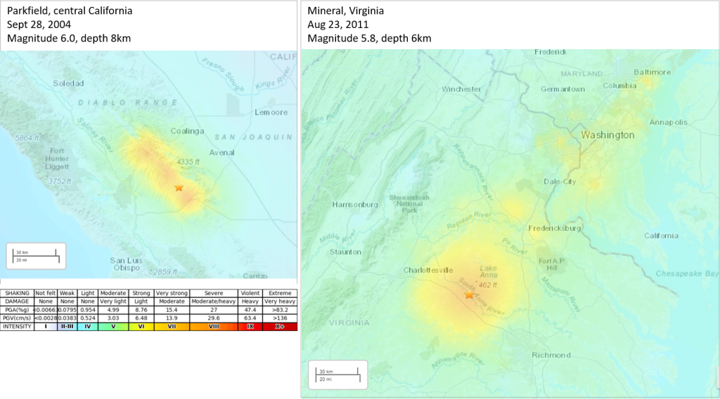
- The East Coast has much older rocks and generally harder rocks (igneous and metamorphic predominantly), which means they tend to be denser. The increased density allows the shaking to transmit faster and farther through them than the younger, less dense (and more sedimentary) rocks found in the west. This also explains why even though the shaking transmitted farther, it is not as strong, reaching maximum levels of VII to VIII instead of VIII to IX as seen in the west.
- Because of the ongoing tectonic activity on the west coast (active San Andreas fault system, convergent boundaries along the remaining coastline, and various internal fault structures associated with the mountains on the west coast) there is a large and active network of faults compared to the old and “healed” faults on the east coast (the Appalachians are also full of faults, but they have been sitting inactive for a very long time which makes them harder to move). The young faults in the west can more easily absorb energy instead of transmitting it like the faults in the east do, meaning seismic waves will not travel as far before running out of energy.
- The final reason is related to population. Remember, intensity is also a measure of building damage. There is a much higher population density along the East Coast (particularly this portion of the East Coast) compared to central California and the buildings are on average older and not made to withstand earthquake shaking. So, with many buildings packed together, and minimal earthquake damage prevention used in the construction, smaller amounts of shaking will result in greater building damage.
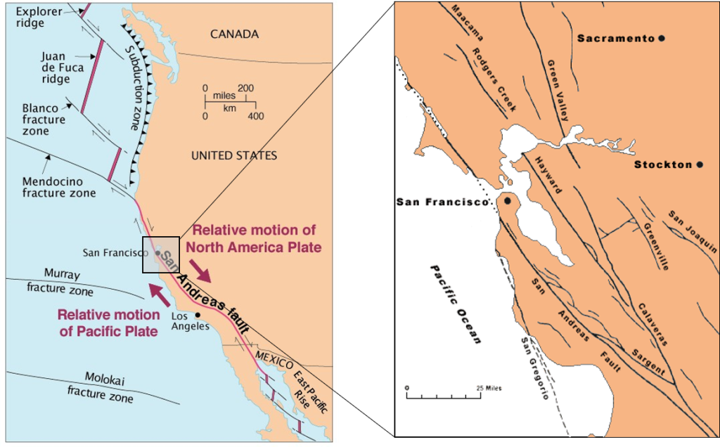
San Andreas Fault System
While typically shown on a map as a single line making up the transform boundary between the North American Plate and the Pacific Plate in the region of California, the San Andreas Fault is more properly called the San Andreas Fault System as it is a network of faults, not a single fault, making up this transform boundary (Figure 1B.5.6). The fault labeled the San Andreas is the major fault in this system.
Try it for yourself!
