4. Locating Earthquake Epicenters
4.1 Recording Seismic Waves Using a Seismograph
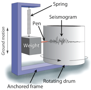
A seismometer is an instrument that detects seismic waves. An instrument that combines a seismometer with a device for recording the waves is called a seismograph. Figure 1B.4.1 shows how a mechanical seismograph works. The instrument consists of a frame or housing that is firmly anchored to the ground. A mass is suspended from the housing and can move freely on a spring. When the ground shakes, the housing shakes with it, but the mass stays fixed. A pen attached to the mass moves up and down on a rotating drum of paper, drawing a wavy line, the seismogram.
Here is an animation demonstrating how this works (Source: IRIS. Public Domain. Found here.)
Modern seismometers are electronic instead of mechanical. In place of a pen and a drum of paper, the relative motion between the weight and the frame generates an electrical voltage that is recorded by
a computer. The orientation of the weight and frame in the figure above would record vertical ground motion, but by changing the arrangement of the spring, weight and frame, seismometers can
record motions in all directions.
Seismograms are the record of the ground shaking at the location of the seismometer. This is the “squiggly line” recording shown in Figure 1B.4.2 below. The x-axis (horizontal axis) is time, measured in seconds, and the amplitude (height) of the “squiggle” is a measure of ground displacement (movement), typically measured in millimeters. The pattern of the line shows the various seismic waves as they arrive at the seismometer. P-waves are the fastest, and always first to arrive and be recorded, then S-waves are second, and last to arrive are the surface waves all grouped together. When there is no earthquake reading, there is just a straight line except for small wiggles caused by local disturbance or “noise”.
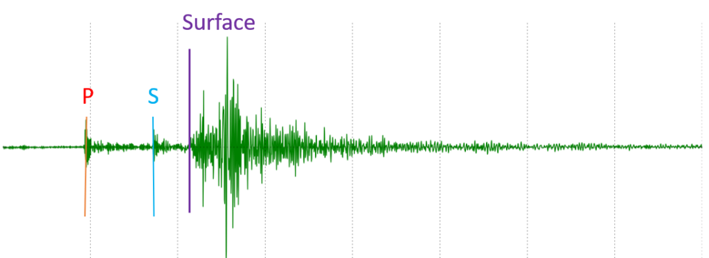
Can you pick out the P, S, and Surface wave arrivals?
Test yourself! On the image below see if you can pick out where the first arrivals of P, S, and surface waves would be marked on the seismogram. When you think you know, slide the bar to the right and see how well you did!
4.2 Locating an Epicenter
The time delay between the first P-wave and first S-wave arrival is especially important. It is used to calculate how far away the earthquake epicenter is from the seismic monitoring station. This is called the S-P arrival time difference or S-P interval. Because P-waves travel faster than S-waves, as the waves travel away from the location of an earthquake, the P-wave gets farther and farther ahead of the S-wave. Therefore, the farther a seismic monitoring location is from the location of an earthquake, the longer the delay between when the P-wave arrival is recorded and when the S-wave arrival is recorded.
Think of this like two runners who run at different speeds. If runner A is running at a pace of 7 min per mile and runner B is running at a pace of 9 min per mile, runner A will cross the first mile marker 2 minutes ahead of runner B. At the 2-mile mark, runner A will now be 4 minutes ahead of runner B (14 total minutes of running vs. 18 total minutes of running). In this way, the time gap will continue to lengthen between the two runners until they have used up all their energy and just cannot run anymore, which happens with seismic waves too. Putting this into “seismic-speak”, mile marker 1 would be like a seismic monitoring station where an S-P arrival time difference of 2 minutes is recorded. Mile marker 2 would be a second, farther seismic monitoring station where an S-P arrival time difference of 4 minutes is recorded.
Just by comparing S-P arrival time differences on seismograms recorded at different seismic stations (but for the same earthquake!), a relative distance (i.e., which one is closest vs farthest away from the epicenter) can be determined.
Check your understanding: Relative distance to an earthquake
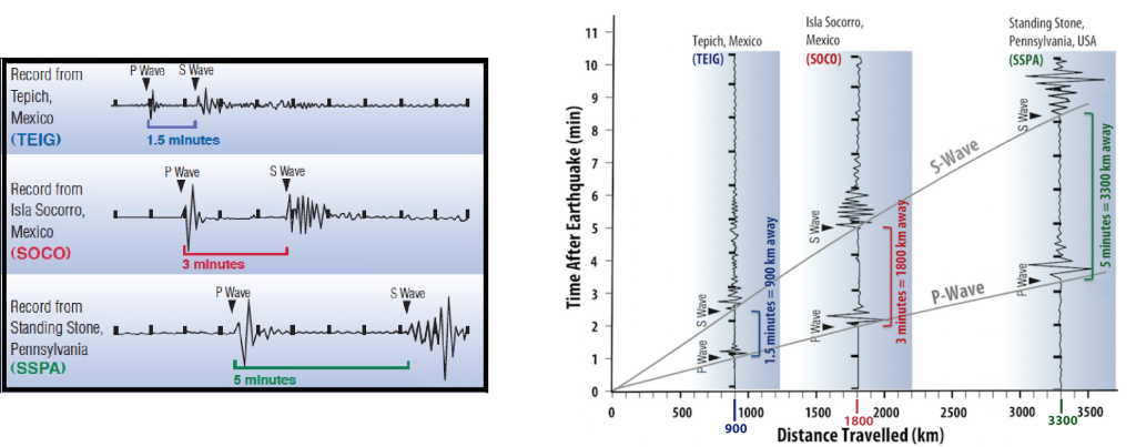
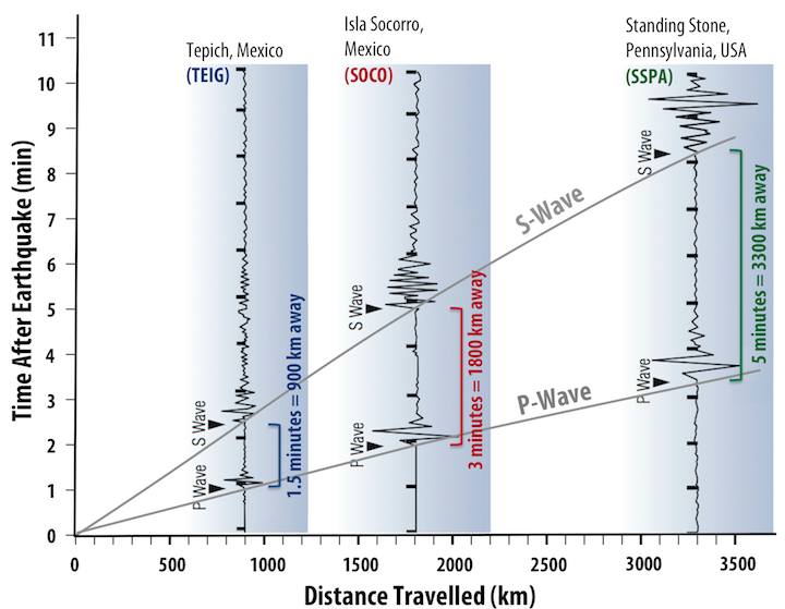
The speeds at which P and S waves travel through the Earth are well known, so an exact distance from the seismic station to the epicenter of an earthquake can be calculated using only the S-P arrival time difference. This can be done graphically as shown in Figure 1B.4.4, where the well-known relationship between time and distance travelled of P and S waves are plotted as grey lines, these are called travel-time curves (right hand side graph). The left-hand side shows three seismograms from three different seismic stations, but all recording the same earthquake. On the right-hand side, these seismograms have been turned 90o and superimposed and aligned along the graph so that the gap between the P-wave and S-wave travel-time curves match the delay between P-wave and S-wave arrivals on the seismogram. The distance of each seismic station from the earthquake is then read from the horizontal axis of the graph.
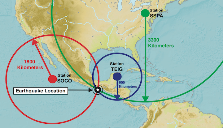
This is how distance from the seismic station to the earthquake is determined, however, this does not provide any information about the direction from which the seismic waves came. The possible locations of the earthquake can be represented on a map by drawing a circle around the seismic station, with the radius of the circle being the distance determined from the P-wave and S-wave travel times (Figure 1B.4.5). If this is done for at least three seismic stations, the circles will intersect at the origin of the earthquake. Note that this is the map location for an earthquake (i.e., the epicenter not the hypocenter). This method is called trilateration (you will often see this referred to as triangulation, which is fine although not technically correct as triangulation requires using angles while trilateration uses distances. Potato, po-tah-to).
Check your understanding: Trilaterating an earthquake epicenter
This is a two-part exercise. In the first part you will use the seismogram information to drag and drop circles of different radii around seismic stations on a map. Once you have placed those circles correctly, you will use that to complete the flashcard in part 2 to identify which numbered location represents the epicenter for the earthquake.
