3. Climate Forcing Mechanisms
3.1 Weather vs. Climate
When discussing what causes climate to change, it is important to understand the distinction between weather and climate. Weather is the daily or otherwise short-term conditions (temperature, whether it is rainy or snowy, wind, humidity, etc.) occurring at a specific time and place. Climate is a long-term averaging of weather conditions – temperatures, rainfall, etc. – over several decades; typically 30 years or more.
A simple way to think through if something is weather or climate is to think about clothing. Knowledge of the weather will determine what you wear that day. Shorts and a T-shirt? Rain jacket? Full one-piece 80’s neon green snowsuit? In contrast, climate will influence the type of clothes you generally have in your closet. For example, if you lived in Hawaii your closet would likely be full of swimsuits, shorts, flip flops, and maybe a flowery shirt or two, but probably not snow boots and a heavy winter down jacket. If you lived in Alaska, your closet would definitely have snow boots and a warm jacket and likely lots of sweaters and thick wool socks (maybe still a Hawaiian shirt though!).
3.2 Climate Forcing Mechanisms
Changes to Earth’s systems that affect how energy flows within the system or into and out of the system cause changes to Earth’s energy budget, thereby affecting climate. The processes that cause these changes are termed climate forcing mechanisms and they can be grouped into 3 broad categories: processes that change the amount of incoming solar energy, processes that change how heat is transferred between equatorial and polar regions, and processes that change how heat is transferred between Earth’s surface and the atmosphere. Climate is very complex with many interconnected parts. The sections below discuss some of the mechanisms that control climate, but a complete understanding of climate includes more than just these.
Solar Energy Variability
The amount of energy radiated from the sun is averaged out to be about constant, at least over the time scales of human life. The sun, like any other star, has a lifecycle such that at birth the sun gave off less energy than it does today, and it has slowly become larger, brighter, and hotter over time. At some point about 5 billion years from now it will become a red giant (a dying star) and expand large enough to engulf planets within the inner solar system, including Earth. So, while solar radiation has slowly increased since the birth of the Sun, the billions of years of time over which this happened means that on human lifetimes, or even the time scale of human evolution, the amount of increase is not noticeable and is not influencing climate.
Sunspots
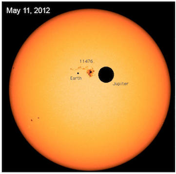
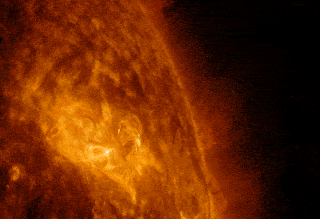
There is, however, solar variability that is noticeable on a human time scale. Sunspots are caused by strong disturbances to the Sun’s magnetic field, often described as magnetic storms, which create dark patches on the surface of the Sun (Figure 3A.3.1). These dark patches are highly variable in size, ranging from smaller than Earth to 40 times Earth’s size, although typically they are roughly the same size as Earth. They can last for just a few hours or remain for many months.
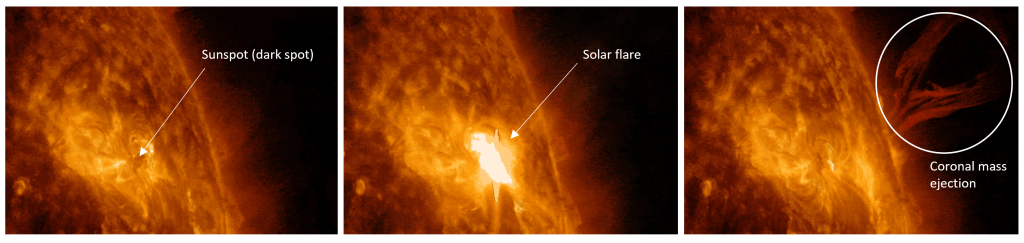
The dark area of the sunspot is cooler than the surrounding Sun but the tangling of magnetic field lines that creates the sunspot can lead to sudden releases of large amounts of radiation through solar flares and coronal mass ejections. Figure 3A.3.2 shows still photographs taken from a gif put together by NASA’s Solar Dynamics Observatory for ease in labelling the sunspot, solar flare, and coronal mass ejection components. The gif is available here: solar flare
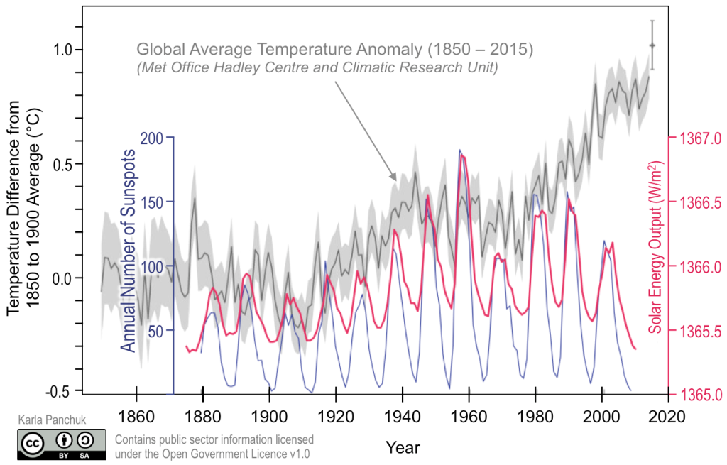
While sunspots themselves are cool, the solar flares and coronal mass ejections associated with them mean periods of high sunspot activity result in increased solar radiation reaching Earth. The number of sunspots present increases and decreases over an approximately 11-year cycle. As shown in Figure 3A.3.3, the 11-year sunspot cycle corresponds to an 11-year cyclical variation in energy output from the sun, however, when compared with temperature differences on Earth, there is no clear connection. In other words, sunspot activity changes solar radiation, but the effect on Earth is minimal and overshadowed by other factors that cause climate to change.
Milankovitch Cycles
Milankovitch Cycles is the collective term for the cyclical changes in Earth’s orbit and rotation. These consist of changes to eccentricity, obliquity, and precession that were first described by Yugoslavian engineer and mathematician Milutin Milanković (anglicized as Milankovitch) in the early 1900s. He recognized that cyclical variations in Earth’s orbit and rotation do not change how much solar radiation is received globally on Earth, but they do change where incoming solar radiation is focused on the planet. Glaciations are most sensitive to solar energy received (or not) at higher latitudes, roughly the latitudes of the Arctic and Antarctic Circles. As continents are configured today, this is most significant in the Northern Hemisphere, because there is almost no land in the Southern Hemisphere at this latitude on which to grow glaciers.
Eccentricity is a measure of how circular or elliptical Earth’s path is around the Sun. Higher eccentricity means that the orbit is more elliptical and lower eccentricity means the orbit is more circular. This is demonstrated in the animation from NASA/JPL-Caltech below. Earth’s orbital path is a result of the gravitational pull from the sun and is broadly circular. Additional gravitational pulls from the two largest planets in the solar system, Jupiter, and Saturn, pull on the Earth as well and cause the orbital path to vary between an almost perfect circle to slightly elliptical. Earth’s orbit slowly adjusts back and forth between these two end members over an interval of approximately 100,000 years. When eccentricity is high, the distance between Earth and the Sun varies more from season to season than it does when eccentricity is low. A more circular path means less seasonal variation in temperatures. At its most elliptical, there is a 23% difference in how much solar radiation reaches Earth when it is at its closest position to the Sun in its yearly orbit compared to when it is at its farthest position from the Sun. Currently the Earth’s eccentricity is slowly decreasing and close to reaching its lowest eccentricity in the 100,000 year cycle.
Obliquity is the angle that Earth’s rotation axis is tilted relative to its orbital path around the Sun. The fact that Earth’s rotation axis is tilted is why there are seasons on the planet, and why the seasons are opposite in the Southern and Northern Hemispheres. Obliquity varies between 22.1 and 24.5 degrees relative to the orbital plane. A greater tilt/high obliquity makes seasonal temperature differences more extreme because during summer months the Earth is tipped more towards the Sun and during winter is tipped even farther away from the Sun. At low obliquity, the seasons become milder with warmer winters and cooler summers. The hotter summers during high obliquity help glaciers melt while the cooler summers during low obliquity allow ice and snow to build up at high latitudes.
The cycle of obliquity variation is approximately 41,000 years. Currently the Earth’s rotational axis is tilted 23.4 degrees, about halfway between the two extremes, and is slowly decreasing. Earth was at a maximum tilt roughly 10,000 years ago and will reach a minimum tilt roughly 10,000 years from now.
The animation from NASA/JPL-Caltech below demonstrates the variation in obliquity.

The last part of the Milankovitch Cycle is precession. Precession is the wobble that Earth’s rotational axis makes over time. This is the same motion a spinning top toy (like the image to the right) makes as it slows down, where the spinner starts to move in a wide circle instead of standing upright. This wobble is the result of tidal forces created by the gravitational pulls of the Sun and moon and makes a full circle approximately every 26,000 years. Currently the North Pole points towards Polaris (the north star) in approximately 13,000 years (half a cycle from now), the North Pole will point towards Vega; the Earth will have a different north star.
The climatic effects of precession mean that the hemisphere facing towards the Sun when the Earth is at its closest orbital position (called perihelion) and farthest from the Sun during its farthest orbital position (called aphelion) has more extreme seasonal temperature variations and the other hemisphere has milder seasons. After half a precession cycle, the hemisphere facing the Sun during perihelion and away from the Sun during aphelion will have flip flopped. Currently the Northern Hemisphere is facing towards the Sun during perihelion and away from the Sun during aphelion.
The animation from NASA/JPL-Caltech below demonstrates the wobble of precession.
The effects of eccentricity, obliquity, and precession build on each other to influence climate. A key factor for creating glacial conditions, as it relates to Milankovitch Cycles, is having milder seasonal temperature variations between summer and winter. Cool summers mean less ice and snow deposited during the winter months melts away allowing glaciers to develop and grow. The effects of all three cycles are evident in geochemical climate data shown in Figure 3A.3.4 below. This is a series of 4 graphs (A-D) showing eccentricity (A), obliquity (B), and precession (C) changes from 800,000 years ago through to today and projected forward to 800,000 years in the future. The vertical black line running down the middle of the diagram marks the present day. These are compared with global temperature changes (D) determined from data collected from the Vostok ice core in Antarctica.
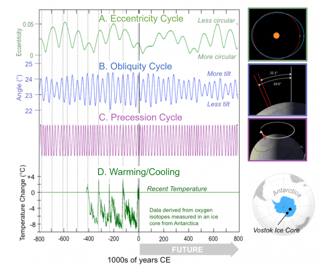
On this graph, peak global temperatures are marked by vertical dashed lines corresponding to the peaks on the Vostok ice core temperature record (graph D). These would be times of lower glacial ice volume, higher temperatures, and higher sea levels. The timing for these peak temperatures is approximately every 100,000 years, suggesting eccentricity played a role in controlling large glacial and interglacial (warm) cycles over this time frame. Between 3 million years ago and 800,000 years ago, climate varied closer to a 41,000-year cycle implying obliquity influenced more control over this time.
Over Earth’s history, no single orbital cycle has had a dominant influence on climate change. While Milankovitch Cycles certainly influence climate, helping to control the timing of glacial and interglacial cycles, the amount of cooling or heating that results from orbital changes is not sufficient to cause temperatures to change as much as the geological record indicates they have. Other factors must be forcing climate as well.
Check your understanding: Climate and solar energy variability
Heat Transfer From Equator to Poles
The surplus of heat energy at the equator gets transferred towards the poles to replenish the energy emitted there. Movement of air and water both circulate this excess heat, and the placement of continents controls how easily air and water masses can travel between equatorial and polar regions.
Atmospheric Circulation
Atmospheric circulation is the large-scale movement of air resulting from unequal heating and cooling across the planet. This circulation moves air from high to low pressure zones. Areas of higher heat where incoming solar radiation is more direct, such as the equator, are low pressure zones where hot air is rising. Areas of lower heat where incoming solar radiation is at a low angle, such as the poles, are high pressure zones where cold air is sinking. Overall, this creates a flow of air from the high-pressure poles towards the low-pressure equator. This large-scale flow is divided into three sets of convection cells, each spanning 30 degrees of latitude, with the base of the convection cell being the surface winds on the planet. Figure 3A.3.5 illustrates the convection cells and the surface winds these create. From the equator to 30 degrees north or south is the Hadley convection cell, the base of which is the Trade Winds that blow from 30 degrees towards the equator in a broadly easterly direction. Between 30 and 60 degrees north or south is the Ferrell (or Mid-Latitude) convection cell creating the Westerlies, which is the wind that blows from 30 degrees towards 60 degrees in a westerly direction. The third set of convection cells is the Polar convection cell which generates the Polar Easterlies, a wind that blows from the poles towards 60 degrees north or south. In these convection cells, air is rising (low pressure zones) at the equator and at 60 degrees north and south. Air is falling (high pressure zones) at 30 degrees north and south and at the poles.
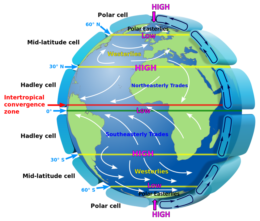
These atmospheric convection cells help redistribute heat around the planet, but they also control long term climate patterns of precipitation. Zones of high pressure where dry air masses are sinking have very little precipitation and the dry air masses drive increased evaporation. These zones are where the major deserts on the planet are located like the subtropical (around 30 degrees north and south) deserts of the Sahara, Gobi, Sonora, and Namib deserts and the two polar deserts.
Low pressure zones, in particular around the equator, receive high rainfall amounts. At the equator, the Intertropical Convergence Zone (ITCZ), where the north and south Trade winds flow to meet each other, is characterized by frequent thunderstorms and heavy rains.
Surface Ocean Currents
The flow of the winds set up by the atmospheric circulation cells transfer energy to the surface of the oceans generating the surface ocean currents. These currents move only the surface layer of ocean water to a depth of about 100m. Deeper ocean water is not affected by the transfer of wind energy. While air can circulate relatively freely across the planet, ocean currents are diverted by the edges of continents and turned to create large circular flows of water called gyres. There are six major surface currents on the planet, five of which are gyres. The five major gyres on the planet are the North Atlantic, the South Atlantic, the North Pacific, the South Pacific and the Indian Ocean Gyre (Figure 3A.3.6). These gyres bring warm water from the equator past the eastern edges of the continents (the western part of the ocean basin) and towards the poles. On the return path, the gyre is transporting cold water from the polar regions past the western edges of continents (eastern part of the ocean basin) towards the equator.
As water has a higher heat capacity (i.e., can “hold” more heat) than air, massive amounts of heat can be transferred from the equator to the poles via these currents. The presence of a warm or cold current flowing past the edge of the continent also controls climatic conditions in the area as some of the heat (or lack of heat) is transferred to the continent. This is why the west coast of the U.S., like California, has cooler and dryer temperatures than an area at equal latitude in the eastern U.S., like Georgia. Georgia is hotter and more humid because of the excess moisture and heat supplied by the Gulf Stream.
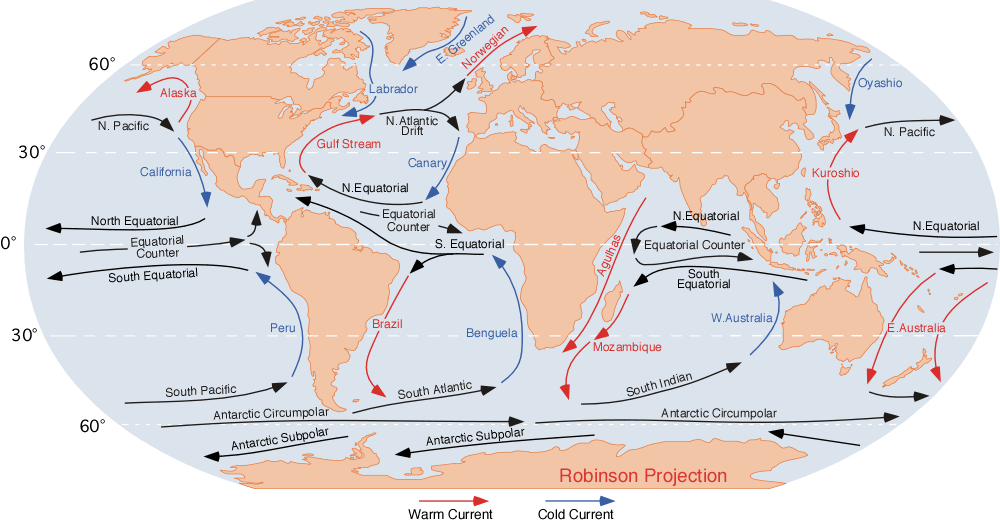
One major current is not a gyre and moves only cold water. The Antarctic Circumpolar Current in the Southern Ocean makes a continuous circle around Antarctica because there are no land masses in this area to interrupt and divert this current into a gyre.
Thermohaline Circulation
While wind drives surface currents, this only involves a small portion of the ocean’s water. Thermohaline circulation is what moves the rest of the ocean’s water. It is a whole ocean cycling of water and is the mechanism by which the whole ocean transfers heat. Thermohaline circulation is created by density differences between the warmer and less salty (less dense) currents which flow on or near the surface and the colder, saltier, and therefore denser currents that flow deep in the oceans.
Thermohaline circulation is sometimes referred to as the “Ocean Conveyor Belt” as the density driven current creates a large cycle of whole ocean movement (Figure 3A.3.7). Along this conveyor belt, cold, deep-water currents are generated in two main locations, in the North Atlantic Ocean near Greenland and in the Southern Ocean adjacent to Antarctica. At these locations, the surface water cools and the formation of sea ice freezes water into ice but leaves behind the salt content increasing salinity levels. This creates denser water that sinks to become a deep-water current. Deep water eventually rises, or upwells, to supply the warmer, shallow water current again in the Indian Ocean and in the Pacific Ocean north of the equator. Upwelling replaces water lost to high evaporation at these locations.
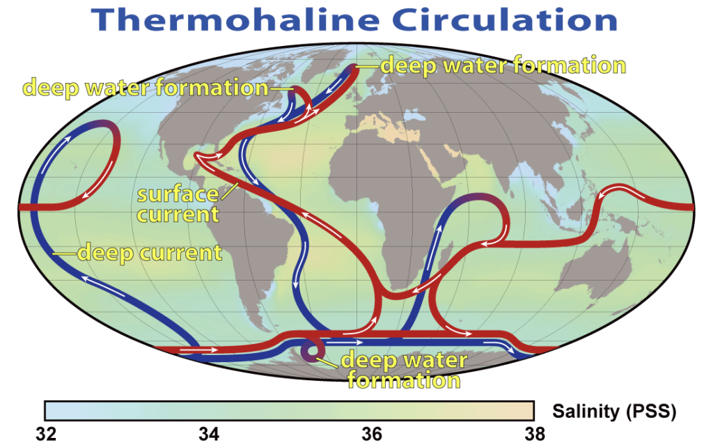
This whole ocean cycling is important for heat transport, bringing warmth to polar regions and colder water to the tropics, stabilizing temperatures at both locations. Climate change could significantly impact thermohaline circulation by slowing or stalling the formation of deep water. The ice sheets on Greenland and Antarctica are highly vulnerable to warming and as they melt, they supply freshwater to the ocean areas where deep water formation occurs. Freshwater is less dense than salt water, so a rapid influx of freshwater could slow or even stop deep water currents from forming. In addition, the formation of deep water near Greenland also helps drive the Gulf Stream, the surface warm water current that brings heat past the east coast of the U.S. and then across the North Atlantic to the UK and Scandinavia. Without the heat from the Gulf Stream, northern Europe would have much colder conditions and freezing in cities that are normally ice free.
Location of Continents
Plate tectonics is responsible for changing the location of the continents, and as such exerts an underlying control on many aspects of climate. Changes to the locations of continents adjusts which areas receive more direct versus indirect solar radiation and therefore the surface area of landmass at appropriate latitudes for the growth of continental glaciers. If the continents were in a different configuration, it would alter where surface currents flow, and therefore which areas receive warm and cool water. Continent location also alters thermohaline circulation. Specific examples of how changing continental locations have affected climate are discussed in Chapter 3B.
Plate tectonics is also responsible for the formation of mountain belts and volcanoes, both of which play a role in the carbon cycle, which has a major impact on how heat is transferred between Earth’s surface and the atmosphere.
Check your understanding: Heat transfer from Equator to Poles
Heat Transfer Between Earth and Atmosphere
The climate forcing mechanisms that alter heat transfer between Earth and the atmosphere are those which affect the reflectivity Earth’s surface and atmosphere and how heat is absorbed by the atmosphere.
Volcanic Aerosols
As detailed in Chapter 1C, volcanoes release carbon dioxide (CO2) and sulfur dioxide (SO2) as their main gases. CO2 acts as a greenhouse gas in the atmosphere, but SO2, when released by a volcano into the upper atmosphere acts to cool the climate. At these altitudes, SO2 combines with water vapor and effectively acts like a mirror, reflecting solar radiation and causing cooling. Large sulfur rich eruptions may cause global temperatures to lower by up to 1 degree Celsius or roughly 2 degrees Fahrenheit, however, volcanic sulfurous aerosols are short lived in the atmosphere, staying only a month to a year or couple of years depending on the size of the eruption. This time frame is too short to affect climate long term.
Albedo
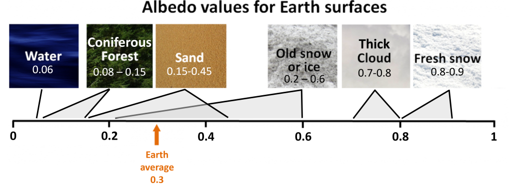
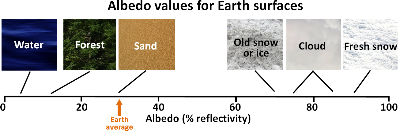
As solar radiation reaches Earth’s surface, some of it is absorbed while some gets reflected. Albedo is the proportion of the solar radiation that is reflected. Surfaces that are highly reflective have higher albedos than surfaces which have low reflectivity. The less reflective a material is, i.e., the lower its albedo, the more energy it absorbs and the more it will heat up. This is important for climate because as land use changes or as glaciers melts the albedo changes causing the amount of solar radiation reflected to adjust as well leading to changes in Earth’s energy budget. The role of albedo as a climate forcing mechanism is discussed in more detail in section 5 of this chapter on climate feedbacks.
A surface’s albedo is given as a unitless value between 0 and 1, where 0 means the material absorbs all sunlight and 1 means the material reflects all sunlight. There are no Earth surfaces that are perfect absorbers or perfect reflectors, rather albedos on Earth range from about 0.04 to 0.9, with an average albedo for the planet being about 0.3. Darker surfaces such as open water or forests have low albedos, while very bright surfaces such as fresh snow have the highest albedos (Figure 3A.3.8).
Greenhouse gases
As you learned in section 2 of this chapter, when the Earth absorbs incoming solar radiation, it heats up and then transfers this heat energy back to the atmosphere through 3 main processes: evaporation, convection, and thermal radiation. The net transfer of energy to the atmosphere from thermal radiation is 17% of the initial incoming solar radiation as shown in Figure 3A.2.3, however the details of this transfer are more complicated.
Recall that incoming solar radiation is dominantly visible light entering the atmosphere, however, the thermal radiation emitted from Earth is dominantly infrared (IR) wavelengths (Figure 3A.3.9).
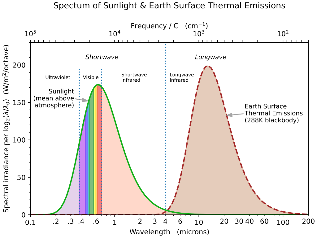
The wavelength of thermal radiation is important for how the atmosphere reacts to incoming energy from Earth’s surface. Not all gases can absorb energy at these longer IR wavelengths. The gases which can absorb and release energy at IR wavelengths are called greenhouse gases (GHG). In the 17% of thermal radiation emitted from Earth’s surface, 12% escapes the atmosphere, while 5% is absorbed by greenhouse gases in the atmosphere. As GHGs absorb this energy their temperature rises, and they emit IR heat energy back out in all directions. This re-radiated IR energy can then be absorbed by other GHG molecules in the atmosphere causing them to heat up and emit IR energy, which can then be absorbed by yet more GHG molecules, and so on. Eventually the heat being emitted upwards is high enough in the atmosphere there are no more GHGs molecules left to absorb it and it escapes the atmosphere into space.
As GHGs emit IR radiation in all directions, some of this is also emitted back towards the Earth, where the Earth absorbs this radiation and heats up and then re-radiates IR energy of its own…again. In essence, this IR radiation bounces between the Earth and the GHGs in the atmosphere heating up both and some is eventually lost to space. This process heats up the Earth more than it would through absorbing incoming solar radiation alone. The supplemental heating created through this is the greenhouse effect (Figure 3A.3.10). Greenhouse gases radiate the energy equivalent of 100% of incoming solar radiation back to the Earth and in turn the Earth emits the energy equivalent of 117% of incoming solar radiation. This net flow of thermal radiation from the Earth is 17% of incoming solar energy (117% radiated from Earth minus 100% radiated down from GHG = 17% net flow radiated from Earth).
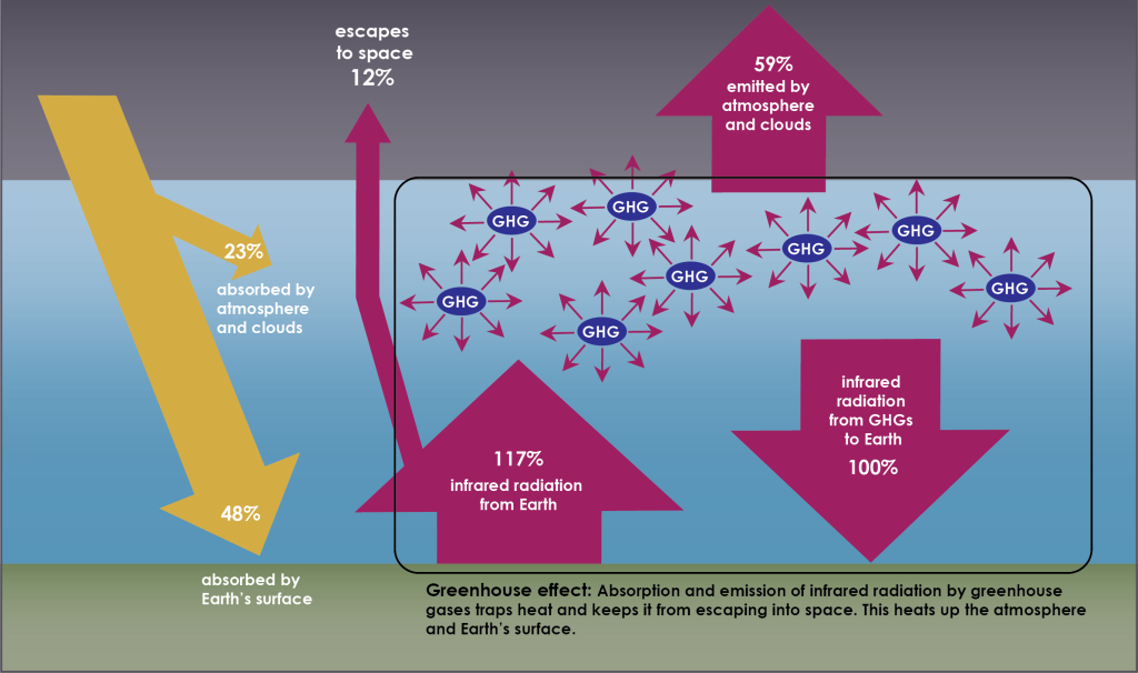
The greenhouse effect raises Earth’s overall average temperature by approximately 15 degrees Celsius (roughly 30°F) compared to if there were no atmosphere or atmospheric greenhouse gases. While the greenhouse effect is often discussed in negative terms, it is actually a vital process that allows Earth to be a habitable planet. Issues arise when a buildup of greenhouse gases beyond normal levels in the atmosphere pushes Earth’s energy budget out of equilibrium. This leads to increased IR absorption and radiation by GHGs and less thermal energy escaping the atmosphere causing Earth surface and atmospheric temperatures to rise.
Major greenhouse gases, from higher to lower concentration in the atmosphere, include water vapor (H2O), carbon dioxide (CO2), methane (CH4), nitrous oxide (N2O), and fluorinated gases. While this is the order of abundance, this is not necessarily the order of significance in terms of impact on climate change. The concentration of a greenhouse gas is important, as a higher concentration of gas means more warming, but its potential to warm the atmosphere and its lifetime also need to be considered.
Water vapor is present at the highest concentrations in the atmosphere; however, it has a very short atmospheric lifetime as the hydrologic cycle moves it through the atmosphere in approximately 9 days. Compare this to the second most abundant gas, CO2, which has an average time in the atmosphere of 100 years, although it can be as long as thousands of years depending on its pathway through the carbon cycle (more on the carbon cycle in the next section). The longer a greenhouse gas can “live” in the atmosphere, the more heat it can absorb and emit, and therefore the more warming it can cause. In addition, water vapor is much more susceptible to small changes in temperature, so as temperature cools water condenses and leaves the atmosphere as rain. As temperatures warm, more water vapor can be held in the atmosphere. Carbon dioxide, however, remains as a gas over a much wider range of temperatures. Because of its ability to remain gaseous and its longer atmospheric lifetime, carbon dioxide acts like the thermostat in the climate system setting the initial temperature conditions which water vapor then responds to. So, while water vapor is more abundant, CO2 is of much more concern when discussing how the greenhouse effect can change climate.
Different greenhouse gases absorb different amounts of energy, which changes their potential for warming the atmosphere. This is quantified as the Global Warming Potential (GWP), which is the amount of energy 1 ton of a GHG absorbs compared to how much energy 1 ton of carbon dioxide absorbs over a given time frame, typically measured as 100 years. A larger GWP means the gas will absorb more energy than CO2 over the same time period. As the gas being measured against, CO2 has a GWP of 1. Methane, the third most abundant greenhouse gas, has a GWP of 30, meaning it can absorb 30 times more energy than CO2 over a 100-year span.
The table below lists the major greenhouse gases in decreasing order of concentration and summarizes their atmospheric lifetimes, GWPs, and human sources of emissions (Figure 3A.3.11).
Greenhouse Gas |
Atmospheric Lifetime |
Global Warming Potential over 100 years |
Human Emission Sources |
| Water vapor (H2O) | 9 days | n/a | As the planet is mostly water, this is the most abundant gas naturally, but human activities such as agriculture, electricity generation, industrial water use, and residential water use can generate water vapor. |
| Carbon dioxide (CO2) | variable; 100 yrs. to thousands of years | 1 | Burning of fossil fuels, solid waste, trees, and wood products. Land use changes such as deforestation cause emissions to increase. Increasing population cause emissions to increase. |
| Methane (CH4) | 12 yrs. | 30 | Livestock and agricultural practices create methane, as does decay of landfill waste. Also created during production and transport of fossil fuels. |
| Nitrous oxide (N2O) | 109 yrs. | 273 | Agricultural and industrial activities create emissions, as does burning of fossil fuels and solid waste. |
| Fluorinated gases | variable depending on gas type; weeks to thousands of years | variable depending on gas type; lowest is around 100 and the highest is 25,200 | All fluorinated gases are industrial chemicals created only by human activities. There are no naturally occurring fluorinated gases. |
Humans
No discussion of climate forcing mechanisms is complete without a discussion of the human, or anthropogenic, role. While there are abundant natural factors that alter climate, the anthropogenic effects are new forcings, at least on the time scale of the planet, that Earth’s energy budget must try to balance.
The two main climate forcings humans affect are albedo and the greenhouse effect. Urbanization and clearing land for agriculture alter the albedo of the landscape. These land use changes, particularly deforestation, also change greenhouse gas emissions to the atmosphere. Other greenhouse gases, such as the fluorinated gases do not occur naturally and are therefore only emitted as a result of human activity. Increased methane emissions also result from land use changes like livestock herding and landfills.
As global population increases, the need for more food, homes to live in, fossil fuels, electricity, and products drives increased anthropogenic greenhouse gas emissions.
Check your understanding: Heat transfer between Earth and atmosphere
References
Buis, A., (2020, February 27). Milankovitch (Orbital) Cycles and Their Role in Earth’s Climate. NASA’s Jet Propulsion Laboratory. https://climate.nasa.gov/news/2948/milankovitch-orbital-cycles-and-their-role-in-earths-climate/
Environmental Protection Agency (n.d.). Climate Change Indicators: Greenhouse Gases. https://www.epa.gov/climate-indicators/greenhouse-gases#ref3
Gingerich, P. D. (2019). Temporal scaling of carbon emission and accumulation rates: modern anthropogenic emissions compared to estimates of PETM onset accumulation. Paleoceanography and Paleoclimatology, 34(3), 329–335. https://doi.org/10.1029/2018pa003379
