6. Energy Resource Comparisons
All energy resources have a range of advantages and disadvantages associated with them, and all energy resources have some level of environmental impact from emissions, land use, water pollution, and so on. Decisions about the energy mix developed by a country require weighing these pros and cons along with analyzing the availability of resources. Some of the specific advantages and disadvantages of energy resources were highlighted in the previous sections of this chapter, and the discussion below compares a handful of characteristics across resources.
6.1 Greenhouse Gas Emissions
Many of the renewable energies and nuclear are considered “emission free”, and while this is true when considering just the production of electricity from those sources, there is no energy source that is emission free if considering a “cradle to grave” approach where emissions from extraction of raw materials through to final disposal of used equipment (like old turbine blades or solar panels) are analyzed. This approach is known as a Life Cycle Assessment (LCA) and provides a wholistic view of environmental impacts including greenhouse gas emissions. Figure 3C.6.1 shows LCA greenhouse gas emissions from the major energy resources.
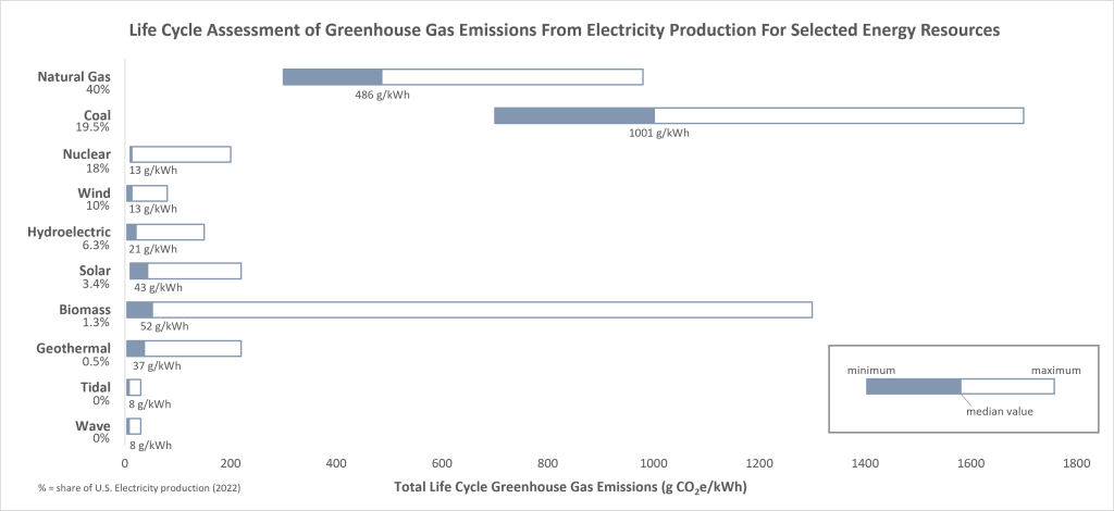
As expected, the median greenhouse gas emissions for fossil fuels are much higher than for all other resources. All energy types have emissions associated with resource extraction (i.e., mining) and power plant construction and maintenance, which for all non-fossil fuel sources makes up most of the emissions, but coal and natural gas also have major emissions during electricity production itself. Notably, while the median emissions for biomass are relatively low (although the third highest behind coal and natural gas), the maximum emissions can be higher than coal. This is entirely based on the type of biomass used and the impact from any land use changes associated with the fuel type. As discussed, hydroelectric produces emissions related to stagnant water behind dams and hydrothermal can have emissions related to the chemistry of the hot water being used.
6.2 Health and Safety
Different energy sources come with different health and safety risks. There are long-term (over the coming decades to century) risks associated with climate change due to greenhouse gas emissions and short-term risks that can affect human health over a period of hours to years. These short-term health risks are from air pollution and accidents. Air pollution is strongly associated with combustion of materials, such as coal and biomass, that release metals, gases, and other particulate matter. Particulate matter is anything suspended in the air that is not a gas. It includes nitrates, sulfates, ash, and mineral dust, and is responsible for most respiratory issues and deaths related to air pollution.
Figure 3C.6.2 shows the death rates per terawatt hour (TWh) for the major energy resources worldwide. For reference, a TWh is about as much electricity as would be used by a town of 150,000 people in the EU on an annual basis. Coal and oil far surpass other resources in causing deaths related directly to the air pollution from combustion with biomass being a distant third but still well above non-combustion created fuels. Natural gas is the cleanest burning of the combustion fuels but still creates more air pollution than non-combustion fuels. The air pollution impacts for this graph were from European power plants which have relatively strict controls on air pollutant emissions and residents live much farther away from these power plants than they do in other countries, resulting in less direct air pollution impacts on health and death. Therefore, these values likely underestimate the health impacts and death rates from combusting these fuels.
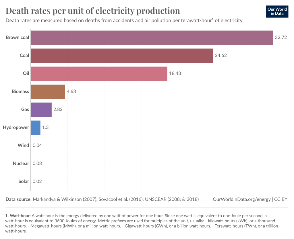
Nuclear and hydroelectric have low death rates overall but are impacted by a small number of catastrophic events. The Chernobyl and Fukushima nuclear disasters are responsible for most nuclear related deaths, killing 433 and 2,314 people, respectively. Even with these deaths, the overall death rate is very low at 0.03 deaths per TWh. A single large dam break in China in 1975 that killed 171,000 people is responsible for elevating the hydroelectric related deaths. Not including this dam break, hydroelectric would have a death rate of 0.04 deaths per TWh instead of 1.3 deaths per TWh.
Deaths in the wind and solar sectors are a result of accidents at the energy facility (i.e., a water tank rupture on site at a solar farm) and therefore not caused by the specific energy resource type itself.
Health impacts from mining activities such as exposure to radiation or carcinogenic materials are not included in these data. Potential exposure to these materials cannot be used to determine death rates. This would impact mine workers in all energy sources, however, the carcinogenic impacts of coal are still higher than from other resources, so even with this information included, the overall deaths from coal would still be higher.
6.3 Land Use
The impact of land use is important because as populations increase there must be enough land to accommodate the corresponding increased needs for agricultural land and energy. Land use for energy also impacts the environment and natural habitats, and it is therefore important to minimize land disturbances.
As individual power plants vary greatly in size between resources and within a resource based on power capacity (i.e., a 1MW solar plant will use far less land than a 1,000MW solar plant), land use comparisons for energy are made by comparing the land use for a set amount of electricity produced. In Figure 3C.6.3 land use is compared based on land required to generate one megawatt-hour of electricity (MWh), in other words, 1,000 kilowatts of electricity used continuously for one hour. This is roughly the amount of electricity used by 330 homes in an hour.
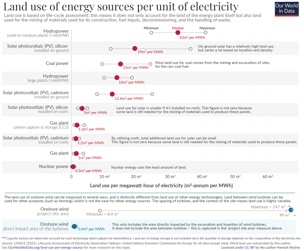
The median land use indicates small to medium scale hydropower projects use the most land per MWh of electricity. This is more than double what a large hydropower project uses because while the overall reservoir for a smaller hydropower plant means less flooded land, the smaller reservoir is also less efficient at producing electricity.
The footprint of a solar farm is also quite large for the electricity produced, but as discussed, advances are being made to create usable land between solar panels which will lessen the land use impact. This is shown in the onshore wind data where an overall land use for the project site is provided, and is the largest land use of all, but the data for the direct impact of the turbines is also given as the land around wind turbines is already mostly used for other activities. This lowers the land use for wind energy to make it among the smallest land uses. Solar land use is greatly reduced if solar energy is utilized on existing buildings alleviating the need for a large field for solar panels. In which case the land use is based on mining activities.
Both nuclear power and coal power require large mining operations, and although coal mining requires more land than mining for uranium, because nuclear power is so efficient, with very high heating values, the amount of electricity produced from a given volume of mined material is much higher. This efficiency lowers nuclear energy land use to the lowest of all energy sources.
Biomass and geothermal energy are not shown on this graph. Geothermal energy requires about 5 m2/MWh, putting it on the low end of land requirements. Biomass on the other hand needs over 800 m2/MWh, making it the most land intensive resource by an order of magnitude.
The other factor that must be considered when discussing land use is whether the land can be continuously used for the lifespan of the electrical power plant. With coal, for example, once a particular coal seam has been extracted, a new coal seam must be mined creating land disturbance in a new area. A solar farm on the other hand, can use the land continuously without needing to clear new land for its entire life span and the life span of future solar farms on that land. In other words, the land for a solar farm (or wind, or geothermal, etc.), which constitutes the largest portion of this energy’s land use, is a “one and done” type use. The largest portion of land use for coal is mining, which by nature means new land will continually need to be brought into the mix.
6.4 Capacity Factor
The capacity factor (CF) is essentially a measure of how reliable an energy source is. It measures how often a power plant is running at its maximum. So, a CF of 100% would mean a power plant is operating at full capacity 100% of the time and a CF of 80% means a power plant is operating at full capacity 80% of the time.
A higher capacity factor means the energy source is more consistently available and therefore more useful as a baseload (or main) power source. Energy sources with low CFs are not going to be reliable as a baseload power source due to their intermittent nature but might work well as supplemental energy sources. Figure 3C.6.4 compares capacity factors for the major energy resources as measured in the U.S. in 2021.
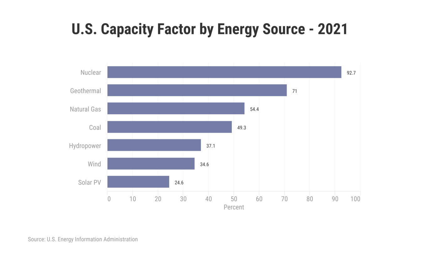
Nuclear power has the highest capacity factor at over 90% with geothermal resources in second place at just over 70%. The two fastest growing renewable resources have the lowest capacity factors at around 35% for wind and 25% for solar. Biomass is not shown on this graph but has a capacity factor of around 60% making it comparable to natural gas.
6.5 Levelized Cost of Electricity
The levelized cost of electricity (LCOE) calculates the cost of generating one unit of electricity to allow for easy cost comparisons between different electricity generation technologies. It includes the cost of building a new power plant, operating and maintaining the plant, and any fuel costs incurred over the lifetime of the plant. It is a measure of how much would need to be charged for electricity production from the plant to break even over the lifetime of the plant.
The transition to clean energy sources requires that these sources are cheaper, have lower LCOEs, than fossil fuels. Until recently, electricity from coal and natural gas was far cheaper than from any other sources and as a result there was little incentive, from an economic standpoint anyway, to explore and develop renewable energy. Over the last decade, LCOEs of renewable energies, particularly solar and wind, have fallen faster than fossil fuels to the point where they are now comparable to natural gas or cheaper (Figure 3C.6.5). These LCOEs reflect the costs for building and maintaining new energy plants, not including any renewable tax credits.
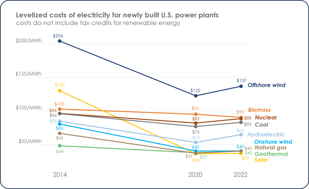
Despite major declines in LCOE for offshore wind, it remains the most expensive energy source because of the challenges of building and maintaining offshore facilities. As tidal and wave energy are not yet utilized in the U.S., there are no associated LCOEs available, however, the offshore building requirements for these energies would likely make their costs very high as well.
For onshore energies, biomass, nuclear, and coal remain the most expensive with minimal cost reductions over the last decade. Geothermal energy also had minimal cost reductions; however, it was the lowest cost source to begin with. As of 2022, new geothermal, natural gas, and wind power plants have about the same LCOE of $40/MWh and solar is slightly below this at $37/MWh.
LCOEs reached a low in 2020 and have risen slightly since then as a result of changing economic conditions coming out of the Covid-19 pandemic and changing access to energy resources due to the Russian-Ukrainian war.
6.6 Jobs
There are several ways job creation can be compared between different energy resources. One way is by analyzing jobs created per unit of installed electrical capacity. Jobs in manufacturing (M) and construction and installation (C&I) are short term, lasting only until the power plant is built and becomes operational. Short term job creation is measured in units of job-years per GW, where one job-year is one full-time job for one person that lasts for a year (Figure 3C.6.6, left). Manufacturing, construction, and installation jobs for a project can last anywhere from a year (or even less) for something like a small solar farm to almost a decade for a large hydroelectric facility. Manufacturing jobs are highest for wind, solar, and small hydroelectric (which includes run-of-river), while natural gas is among the lowest manufacturing job creators. Construction and installation jobs also vary widely, with solar, biomass, and small hydroelectric facilities creating more jobs than coal and natural gas, with natural gas being the lowest C&I job creator of all facilities.
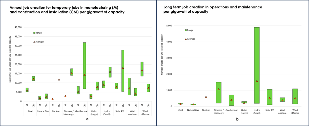
Long term employment is measured in jobs per GW (Figure 3C.6.6, right). These are jobs in operations and maintenance associated with the long-term running of a facility, and therefore not temporary like manufacturing, construction, and installation jobs. Natural gas and coal have the fewest long-term jobs.
Note the difference in scale between the two graphs. Up front jobs like manufacturing, construction, and installation account for the most employment associated with any energy facility. Where these jobs are created are not necessarily local however, as they may take place far away from the energy facility itself, possibly even in a different country depending on the location of the facility. This is particularly true of manufacturing. Construction and installation along with operations and maintenance jobs have a much higher probability of being sourced locally.
Another way to analyze job creation is by looking at the jobs created per amount of money invested. A transition away from fossil fuel resources will require huge amounts of investment, which will be from government spending or influenced by political decisions such as tax credits and government subsidies. Therefore, understanding how investment dollars affect job creation is important as this has an impact on government and investor decisions. Investing in coal and natural gas creates the fewest jobs per million dollars (Figure 3C.6.7). All other energy resources create two to five times more jobs per million dollars than fossil fuel investment.
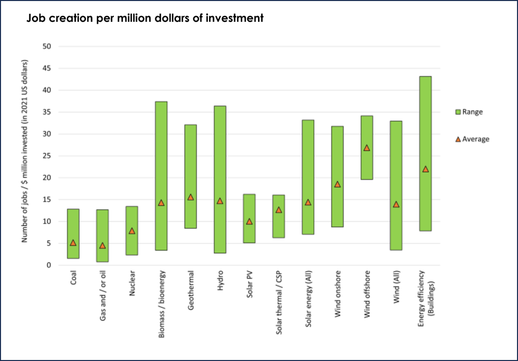
This is positive news as the world transitions away from fossil fuel resources. However, there are concerns that while jobs will be created with new renewable facilities, jobs will be lost as old fossil fuel facilities are retired. This is true, but studies indicate the net effect will be an increase in jobs overall as more jobs will be created than will be lost. While this might be good for the overall job economy it will have local impacts as the jobs will not be in the same location nor necessarily for the same skill set, making a transition from a job in one energy sector to a job in a different energy sector difficult. Having adequate programs available to retrain workers will ensure a smoother transition to clean energy.
References
Hanna, R., Heptonstall, P., & Groß, R. (2024). Job creation in a low carbon transition to renewables and energy efficiency: a review of international evidence. Sustainability Science, 19(1), 125–150. https://doi.org/10.1007/s11625-023-01440-y
National Renewable Energy Laboratory (2021). Life Cycle Greenhouse Gas Emissions from Electricity Generation: Update. https://www.nrel.gov/docs/fy21osti/80580.pdf
Ritchie, H., & Roser, M. (2024, March 18). How does the land use of different electricity sources compare? Our World in Data. https://ourworldindata.org/land-use-per-energy-source
Ritchie, H., & Roser, M. (2024b, March 20). What are the safest and cleanest sources of energy? Our World in Data. https://ourworldindata.org/safest-sources-of-energy
Trainor, A. M., McDonald, R. I., & Fargione, J. (2016). Energy sprawl is the largest driver of land use change in United States. PLOS ONE, 11(9), e0162269. https://doi.org/10.1371/journal.pone.0162269
