21 PivotTables and PivotCharts
PivotTables and PivotCharts

An Excel worksheet can contain thousands upon thousands of rows and columns of data. The amount of data can be overwhelming to try to assimilate and make sense of. There is a wealth of information that can be obtained by using the right tools to condense and organize your data.
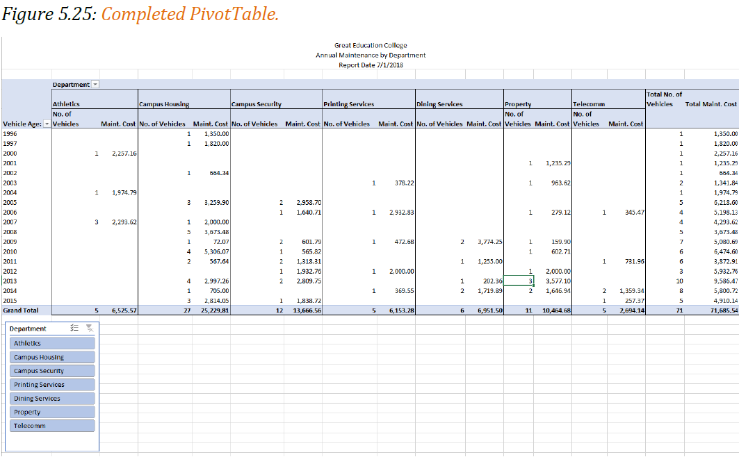
A PivotTable summarizes data using the COUNT, SUM, AVERAGE, MIN and MAX functions. For example, Suni wants you to prepare a presentation for the budget committee that will summarize the college vehicles data. She wants her report to show total cost of annual maintenance by department and age of the vehicles.
Creating a PivotTable
Follow-along file: Continue with Excel Objective 5.00. (Use file Excel Objective 5.07 if starting here.)
We will create a PivotTable to reflect Suni’s report needs. The steps to complete the PivotTable are:
1. Click on the Raw Data worksheet tab to activate the worksheet. Make any cell active in your data range or table.
2. Click on PivotTable from the Tables section of the Insert tab. The Create PivotTable dialog box will appear.

3. Accept the defaults and click OK.
4. A new worksheet is created to the right of your Raw Data worksheet. Click and drag the worksheet tab to the right of the Vehicle Subtotal worksheet. Rename the worksheet Vehicle PivotTable.

Figure 5.21 shows the PivotTable elements. We are going to create the PivotTable by dragging fields from the field list into the design area in the lower right section.
5. The first field we will drag down is the department field. Drag the field into the Rows area by clicking on the field name, holding left mouse, and dragging to Rows. As soon as you release the mouse you will see the departments appear in the PivotTable area.
6. We will put the vehicle year field into the columns section of the pivot table by dragging it to Columns.
7. Suni is looking for annual maintenance on the vehicles, so drag the annual maintenance field to the Values section of the design area.
Rearranging a PivotTable
In evaluating the layout for the PivotTable, Suni determines she would rather see the years going down the rows and the departments as the columns. We will drag and drop the fields to recreate the chart.
8. Click on Department in the Rows section and drag it up into the Columns area.
9. Click on the Year in the Columns section and drag it down to rows. This makes the information easier to read.
In looking at the data, it is difficult to determine how many vehicles the data applies to. Suni asks you to include a count of the vehicles in your layout.
10. Drag the Style field into the Values section. Since the Style field contains text, Excel automatically applies a COUNT to the data.
Suni likes this layout, but now it needs to be formatted and titled for a professional presentation.
Value Field Settings
11. Click any cell in the Sum of Annual Maintenance column of the PivotTable report.
12. Left click the Sum of Annual maintenance field in the Values section. Select Value Field Settings from the drop-down menu.

13. The field name is too wide and makes the PivotTable look long and drawn out. Change the Custom Name to Maint. Cost.
14. Click on Number Format and change the number format to Currency. In the symbol box select None from the drop-down. See Figure 5.23.
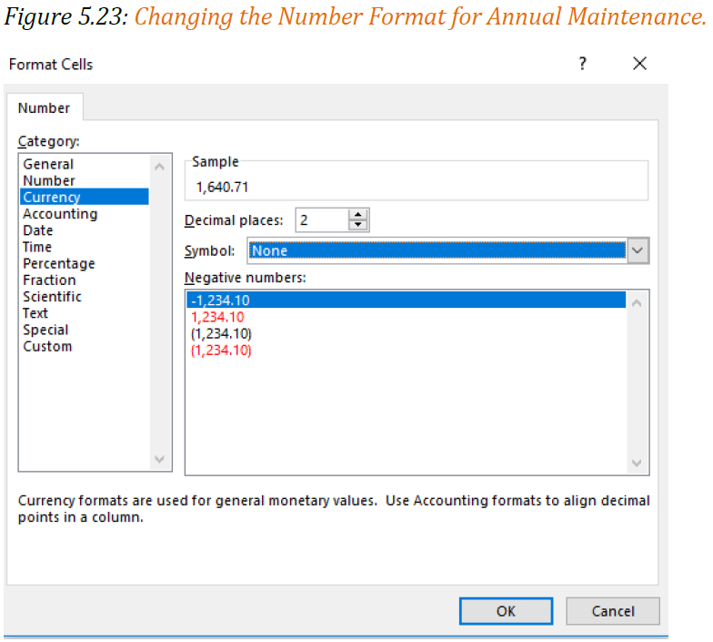
15. Click OK to accept the Format Cells changes.
16. Click Ok to accept all changes to the Annual Maintenance field in the PivotTable.
17. Left click on the Count of Style field in the Values layout. Select Value Field Settings.
18. Change the Custom Name to No. of Vehicles. Click OK to close the dialog box.
PivotTable Formatting
PivotTables are inherently ugly and require a bit of formatting to make them easily understandable to the reader. Remember, it must tell its own story.
19. Click in cell B3. In the formula bar type; Department: Hit Enter.
20. Click in cell A5. In the formula bar type: Vehicle Age. Hit Enter.
21. Suni wants to see the No. of vehicles before the maintenance cost. In the Values section of the Pivot table design area, drag and drop the No. of Vehicles field above the Maint. Cost.
22. Highlight B4:C24 and apply an outside border. Repeat this step for each of the departments across the page.
23. The last formatting change we will make to out PivotTable is the worksheet title. We already have a blank row in row 1, so adding a row is not needed.
24. Select the range A1:Q1. Merge and Center the row.
25. Type the following title into A1.
Minnesota State College
Annual Maintenance by Department
Report Date 3/1/2025
26. Resize Row 1 to fit the 3-line title.
Manually create a PivotTable
Follow the instructions below for how to manually create a PivotTable. Click a cell in the source data or table range and choose Insert>PivotTable>From Table/Range. Excel will display the PivotTable from table or range dialog with your
range or table name selected. In this case, we’re using a table called ‘Timber Creek’!$A$1:$F$228.
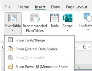

In the Choose where you want the PivotTable report to be placed section, select New Worksheet, or Existing Worksheet. For Existing Worksheet, you’ll need to select both the worksheet and the cell where you want the PivotTable placed.
If you want to include multiple tables or data sources in your PivotTable, click the Add this data to the Data Model check box. Click OK, and Excel will create a blank PivotTable, and display the PivotTable Fields list.
Recommended PivotTables
If you have limited experience with PivotTables, or are not sure how to get started, a Recommended PivotTable is a good choice. When you use this feature, Excel determines a meaningful layout by matching the data with the most suitable areas in the PivotTable. This helps give you a starting point for additional experimentation. After a recommended PivotTable is created, you can explore different orientations and rearrange fields to achieve your specific results.
Click a cell in the source data or table range and choose Insert>Recommended PivotTables
Excel analyzes your data and presents you with several options, like in this example using the household expense data.
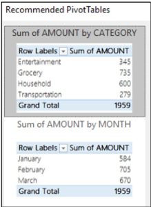
Select the PivotTable that looks best to you and press OK. Excel will create a PivotTable on a new sheet and display the PivotTable Fields List.
Slicers
Slicers are a tool in Excel Pivot tables and Excel tables that allows you to insert a slicer on the face of the worksheet that easily filters out data. You can select a slicer from any field in the PivotTable, or table.
Now that we have the PivotTable report finalized, we will add a slicer that will make it easy to filter data by Department. The steps we will use are:
1. Click anywhere in the PivotTable to activate the PivotTable Tools Ribbon.
2. Click on Insert Slicer from the Filter section of the Analyze tab of the PivotTable Tools.
3. The Insert Slicers dialog box will appear. Click on Department to create a slicer for the department.

4. Click OK.
5. Move the slicer so it is positioned below the PivotTable.
6. Click on a department to filter out all the other departments. You can select multiple departments by holding down the Ctrl key and clicking on department names.
Group or ungroup data in a PivotTable
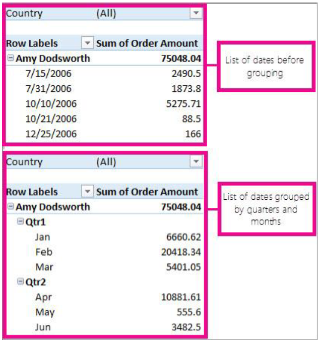
Grouping data in a PivotTable can help you show a subset of data to analyze. For example, you may want to group an unwieldy list of dates or times (date and time fields in the PivotTable) into quarters and months, like this:
Note: The time grouping feature is new in Excel 2016. With time grouping, relationships across time-related fields are automatically detected and grouped together when you add rows of time fields to your PivotTables. Once grouped together, you can drag the group to your Pivot Table and start your analysis.
Group fields
1. In the PivotTable, right-click any numeric or date and time field, and click Group.
2. In the Starting at and Ending at box, enter this (as needed):

- The smallest and largest number to group numeric fields.
- The first and last date or time you want to group by.
The entry in the Ending at box should be larger or later than the entry in the Starting at box.
3. In the By box, do this:
- For numeric fields, enter the number that represents the interval for each group.
- For date or time fields, click one or more date or time periods for the groups.
You can click additional time periods to group by. For example, you can group by Months and Weeks. Group items by weeks first, making sure Days is the only time period selected. In the Number of days box, click 7, and then click Months.
Tip: Date and time groups are clearly labeled in the PivotTable; for example, as Apr, May, Jun for months. To change a group label, click it, press F2, and type the name you want.
Group date and time columns automatically (time grouping)
Note: The time grouping feature is available in Excel 2016 only.
- In the PivotTable Fields task pane, drag a date field from the Fields area to the Rows or Columns areas to automatically group your data by the time period.

Excel automatically adds calculated columns to the PivotTable used to group the date or time data. Excel will also auto collapse the data to show it in its highest date or time periods.
For example, when the Date field is checked in the Fields list above, Excel automatically adds Year, Quarter, and month (Date) as shown below.

NOTES:
- When you drag a date field from the Field List to the Rows or Columns area where a field already exists and then put the date field above the existing field, the existing date field is removed from the Row or Columns area and the data won’t be automatically collapsed so you can see this field when collapsing the data.
- For a data model PivotTable, when you drag a date field with over one thousand rows of data from the Field List to the Rows or Columns areas, the Date field is removed from the Field List so Excel can display a PivotTable that overrides the one million records limitation.
Group selected items
You can also select specific items and group them, like this:

1. In the PivotTable, select two or more items to group together, holding down Ctrl or Shift while you click them.
2. Right-click what you selected and click Group.
When you group selected items, you create a new field based on the field you are grouping. For example, when you group a field called SalesPerson, you create a new field called SalesPerson1. This field is added in the field section of the Field List, and you can use it like any other field. In the PivotTable, you’ll see a group label, like Group1 for the first group you create. To change a group label to something more meaningful, click it, > Field Settings, and in the Custom Name box, type the name you want.
Tips:
- For a more compact PivotTable, you might want to create groups for all the other ungrouped items in the field.
- For fields that are organized in levels, you can only group items that all have the same next-level item. For example, if the field has levels Country and City, you can’t group cities from different countries.
Ungroup grouped data
To remove grouping, right-click any item in the grouped data, and click Ungroup.
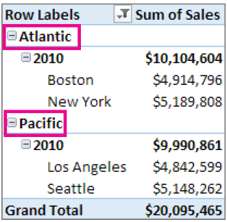
If you ungroup numeric or date and time fields, all grouping for that field is removed. If you ungroup a group of selected items, only the selected items are ungrouped. The group field won’t be removed from the Field List until all groups for the field are ungrouped. For example, suppose you have four cities in the City field: Boston, New York, Los Angeles, and Seattle. You group them so that New York and Boston are in one group you name Atlantic, and Los Angeles and Seattle are in a group you name Pacific. A new field, City2, appears in the Fields area and is placed in the Rows area of the Fields List.
As shown here, the City2 field is based on the City field, and is placed in the Rows area to group the selected cities.

As shown below, the four cities are arranged under the new groups, Atlantic and Pacific.
Note: When you undo time grouped or auto collapsed fields, the first undo will remove all the calculated fields from the field areas leaving only the date field. This is consistent with how PivotTable undo worked in previous releases. The second undo will remove the date field from the field areas and undo everything.
About grouping data in a PivotTable
When you group data in a PivotTable, be aware that:
- You can’t add a calculated item to an already grouped field. You first need to ungroup the items, add the calculated item, and then regroup the items.
- You can’t create slicers for grouped fields.
- Excel 2016 only: You can turn off time grouping in PivotTables (including data model PivotTables) and Pivot Charts by editing your registry.
PivotCharts
Suni would like you to create a chart for her that graphically shows the cost by department. Because of the disparate vales between maintenance cost and number of vehicles for each department, the data in the Vehicle PivotTable would not create a clear and informative PivotChart. We will make a copy of the Vehicle PivotTable worksheet and use the copy to build our PivotChart.
1. Click on the Vehicle PivotTable tab, hold the Ctrl key down while dragging to the right.
2. Rename the new Vehicle PivotTable(2) to Vehicle PivotChart.
3. If the PivotTable Field list is not showing, click anywhere in the PivotTable, from the Show section of the Analyze PivotTable Tools tab, click the Field List button.
4. On the copied PivotTable, in the PivotTable name box on the Analyze tab of the PivotTable tools, rename the PivotTable1 to PivotTable 2. Note: if you don’t rename the PivotTable, it will be linked to the first PivotTable.
5. To eliminate the number of vehicles from our PivotTable so we can create a meaningful chart, drag the No. of Vehicles field out of the Values section. Your PivotTable will now just show the annual maintenance cost by department and year.
6. Click the PivotChart button from the Analyze PivotTable Tools tab.
7. Select the Clustered Column chart type.
8. From the PivotTable Tools Design tab, click the Move Chart button. Move the PivotChart to its own chart sheet called Maint PivotChart.

9. Close the PivotChart field list.
10. From the Design tab of the PivotChart Tools, apply Style 9 to the PivotChart.
11. From the Quick Layout button select Layout 3 which will put the legend below the chart and insert a Title.
12. Click in the title box. In the Formula bar insert the same title you used for the PivotTable.
Great Education College
Annual Maintenance by Department
Report Date 7/1/2018
13. From the Add Chart Element button, add a primary vertical axis.
14. Click in the vertical axis. In the formula bar type: Annual Maintenance Cost
Integrity Check – Pivot Chart
Your PivotChart is dynamically linked to your PivotTable. This means that any changes you make in your PivotTable will change your PivotChart.

Media Attributions
- Insert PivotTable
- Recommended PivotTables
