13 Choosing a Chart Type
Choosing a Chart Type
Learning Objectives
1. Decide which chart type to use.
2. Construct a line chart to show a time series trend.
3. Learn how to adjust the Y axis scale.
4. Construct a line chart to present a comparison of twotrends.
5. Learn how to use a column chart to show a frequencydistribution.
6. Create a separate chart sheet for a chart embedded in aworksheet.
7. Construct a column chart that compares two frequencydistributions.
8. Learn how to use a pie chart to show the percent of total for a dataset.
9. Construct a stacked column chart to show how a percent of total changes over time.
This section reviews the most commonly used Excel chart types. To demonstrate the variety of chart types available in Excel, it is necessary to use a variety of data sets. Therefore, instead of addressing a specific theme, we will use a variety of themes. This is necessary not only to demonstrate the construction of charts but also to explain how to choose the right type of chart given your data and the idea you intend to communicate. Before we begin, let’s review a few key points you need to consider before creating any chart in Excel.
- The first is identifying your idea or message. It is important to keep in mind that the primary purpose of a chart is to present quantitative information to an audience. Therefore, you must first decide what message or idea you wish to present. This is critical in helping you select specific data from a worksheet that will be used in a chart. Throughout this chapter, we will reinforce the intended message first before creating each chart.
- The second key point is selecting the right chart type. The chart type you select will depend on the data you have and the message you intend to communicate. The table below describes how each chart type is used.
| Line Chart: | The line chart is one of the most frequently used chart types because it is used to show trends over time. If your data is depicting changes over time, use a line chart. |
| Column Chart: | Column charts are typically used to compare several items in a specific range of values. Column charts should be used when comparing a single category of data between individual sub-items, such as, for example, when comparing revenue between products. |
| Clustered Column Chart: |
A clustered column chart can be used when comparing multiple categories of data within individual sub-items as well as between sub-items. For instance, you can use a clustered column chart to compare sales for each quarter within each region, as well as between regions. |
| Stacked Column Chart: |
A stacked column chart allows you to compare items in a specific range of values as well as show the relationship of the individual sub-items with the whole. For instance, a stacked column chart can show not only the overall revenue for each year, but also the proportion of the total revenue made up by each region. |
| Pie Chart: | A frequently used chart is the pie chart. A pie chart represents the distribution or proportion of each data item over a total value (represented by the overall pie). A pie chart can only be used for one data series. i.e. sales by product for March or total sales for 2017 by product, etc. |
| Combo Chart: | A combo chart is a visualization that combines two or more chart types into a single chart. Combination charts are an ideal choice when you want to compare two categories of each individual sub-item that would otherwise not present good visual data. They are commonly used to create visualizations that show the difference between targets versus actual results. |
- The third key point is identifying the values that should appear on the X and Y axes. One of the ways to identify which values belong on the X and Y axes is to sketch the chart on paper first. If you can visualize what your chart is supposed to look like, you will have an easier time using Excel to construct an effective chart that accurately communicates your message. Table 4.2 “Key Steps before Constructing an Excel Chart” provides a summary of these points.
- The fourth key point is determining how you can best label your chart to clearly explain to your audience the meaning of the message you are presenting. Your reader should be able to understand what the chart is presenting without having it explained to them.
Integrity Check – Carefully Select Data When Creating a Chart
Just because you have data in a worksheet does not mean it must all be placed onto a
chart. When creating a chart, it is common for only specific data points to be used. To
determine what data should be used when creating a chart, you must first identify the
message or idea that you want to communicate to an audience.
| Step | Description |
| 1. Define your message. |
Identify the main idea you are trying to communicate to an audience. If there is no main point or important message that can be revealed by a chart, you might want to question the necessity of creating a chart. |
| 2. Identify the data you need. |
Once you have a clear message, identify the data on a worksheet that you will need to construct a chart. In some cases, you may need to create formulas or consolidate items into broader categories. |
| 3. Select a chart type. |
The type of chart you select will depend on the message you are communicating and the data you are using. |
| 4. Identify the values for the X and Y axes. |
After you have selected a chart type, you may find that drawing a sketch is helpful in identifying which values should be on the X and Y axes. (The X axis is horizontal, and the Y axis is vertical.) |
Line Chart
Follow-along file: Excel Objective 4.00
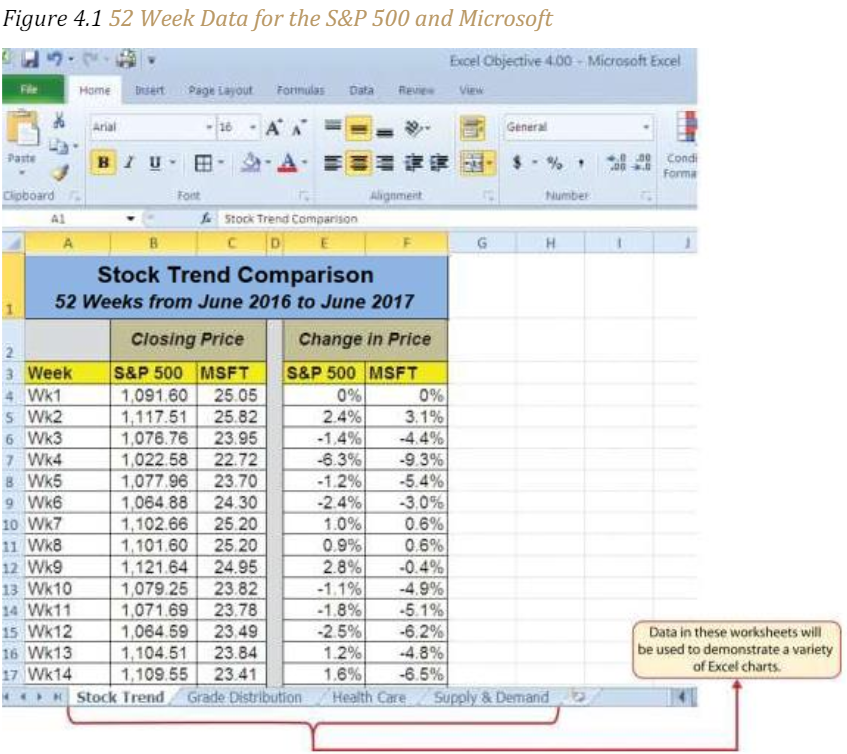
The first chart we will demonstrate is a line chart. Figure 4.1 “52 Week Data for the S&P 500 and Microsoft” shows part of the data that will be used to create two-line charts. The first line chart will show the trend of the S&P 500 stock index. This is an aggregate price index of five hundred of the largest publicly traded companies. This chart will be used to communicate a simple message: to show how the index has performed over a fifty-two- week period. We can use this chart in a presentation to show whether stock prices have been increasing, decreasing, or remaining constant over the designated period.
Before we create the line chart, it is important to identify why it is an appropriate chart type given the message we wish to communicate and the data we have. When presenting the trend for any data over a designated time period, the most commonly used chart type is the line chart. A column chart could be used, but is typically used to show comparative data rather than data over time. Given the four steps outlined above, let’s determine how we will set up our line chart.
• Define the message: Our line chart will show the closing price for the S&P 500 over a 52-week period.
• Define the data needed: The data needed is the week and the closing price of the S&P 500.
• Select a chart type. Since we are looking at the changes in closing price over a designated time period we will use a line chart which most clearly conveys changes over time.
• Identify the values on the X and Y axis. We will put the week number on the X axis because the audience is used to see a time-line progress horizontally and the closing price on the Y axis because it will show the price changes at each point in time.
The following steps explain how to construct this line chart:
1. Highlight the range A3:B55 on the Stock Trend worksheet. Note: Do not select more data than that needed to create a specific chart.
2. Click the Insert tab of the Ribbon. Note: When constructing a chart, you want to have the data labels included. The data labels in A3:B3 will be displayed on the chart and will help identify the data being presented.
3. Click the Line button in the Charts group of commands (see Figure 4.2 “Selecting the Basic Line Chart”).
4. Click the first option from the list, which is a basic line chart. This adds, or embeds, the line chart to the worksheet, as shown in Figure 4.3 “Embedded Line Chart in the Stock Trend Worksheet”.
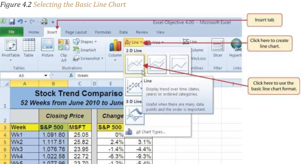
Figure 4.3 “Embedded Line Chart in the Stock Trend Worksheet” shows the embedded line chart in the Stock Trend worksheet. Notice that two additional tabs, or contextual tabs, are added to the Ribbon. We will demonstrate the commands in these tabs throughout this chapter. These tabs appear only when the chart is activated.
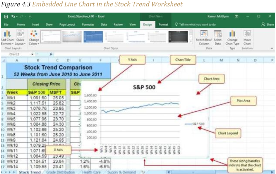
As shown in Figure 4.3 “Embedded Line Chart in the Stock Trend Worksheet”, the embedded chart is not placed in an ideal location on the worksheet since it is covering several cell locations that contain data. The following steps demonstrate common adjustments that are made when working with embedded charts:
1. Moving a chart: Click and drag the upper left corner of the chart to the center of cell H2.
2. Resizing a chart: Place the mouse pointer over the left middle sizing handle, hold down the ALT key on your keyboard, and click and drag the chart so it “snaps” to the left side of Column H. Repeat step 2 to resize the chart so the top “snaps” to the top of Row 2, the bottom “snaps” to the bottom of Row 17, and the right side “snaps” to the right side of Column P.
3. Adjusting the chart title: Click the chart title once. In the formula bar type: 52 Week Closing Price Trend for the S&P 500. Hold the Alt key down and press Enter. This will add a second row to your title. Type June 2017to May 2018. Click Enter.
4. Removing the legend: (If the chart you just inserted does not contain a legend, skip this step.) Because the chart contains only one data series (the Closing Price) we will remove the legend because it is unnecessary. Click the legend once and press the DELETE key on your keyboard. This removes the legend from the chart. Once you remove the legend, the plot area automatically expands.
Figure 4.4 “Line Chart Moved and Resized” shows the line chart after it is moved and resized. You can also see that the title of the chart has been edited to read 52 Week Trend for the S&P 500. Also notice that the sizing handles do not appear around the perimeter of the chart. This is because the chart has been deactivated. To activate the chart, click anywhere inside the chart perimeter.

Adjusting the Y Axis Scale
Follow-along file: Continue with Excel Objective 4.00. (Use file Excel Objective 4.01 if starting here.)
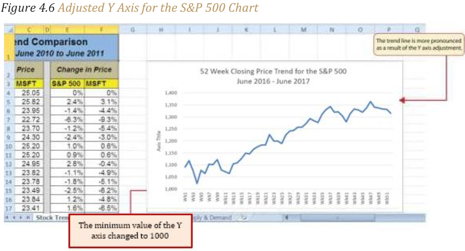
After creating an Excel chart, you may find it necessary to adjust the scale of the Y axis. Excel automatically sets the maximum value for the Y axis based on the data used to create the chart. However, the minimum value is usually set to zero. Depending on the data you are using to create the chart, setting the minimum value to zero can substantially minimize the graphical presentation of a trend. For example, the trend shown in Figure 4.4 “Line Chart Moved and Resized” appears to be increasing slightly. However, the S&P 500 increased by over 20% during this period, which is substantial. The presentation of this trend can be improved if the minimum value started at eight hundred. While it is certainly possible for the S&P 500 to fall below eight hundred, it is most likely remote. The following steps explain how to make this adjustment to the Y axis:
1. Right click anywhere on the Y axis on the 52 Week Trend for the S&P 500 line chart (Stock Trend worksheet) and select Format Axis.
2. The Format Axis dialog box will appear on the right of your worksheet.
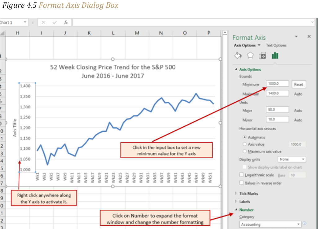
3. In the Axis Options Window, click in the Minimum box and change the minimum value to be displayed on the Y axis from 0 to 1000. This will eliminate white space on your chart that adds no visual value. Press the tab key to display the change in your chart.
4. Because we are dealing in whole numbers we will adjust the values on the Y axis to display with no decimal places. Click on the Number label to expand the Number menu. Under Decimal places, change the value from 2 to 0.
Figure 4.6 “Adjusted Y Axis for the S&P 500 Chart” shows the change in the presentation of the trendline. Notice that with the Y axis starting at 1,000, the trend for the S&P 500 is more pronounced and reflects the substantial increase over the 52-week period. This adjustment makes it easier for the audience to see the magnitude of the trend.
Skill Refresher – Adjusting the Y Axis Scale
1. Right click anywhere along the Y axis to activate it and select Format Axis from the
drop-down quick menu.
2. In the Format Axis dialog box, click in the input box next to the desired axis option
and then type the new scale value.
3. Click on the Number format to expand the Number format options. Change the
number of decimal places, or number format to better convey your information.
4. Click the X button at the top of the Format Axis dialog box.
Line Chart 2: Trend Comparisons Over Time
Follow-along file: Continue with Excel Objective 4.00. (Use file Excel Objective 4.02 if starting here.)
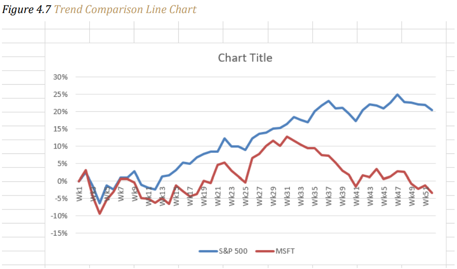
We will now create a second line chart using the data in the Stock Trend worksheet. The purpose of this chart is to compare two trends:
• the change in value for the S&P 500 and
• the change in value of a single stock – Microsoft common stock.
Chapter 3 “Logical and Lookup Functions” presented a personal investment portfolio where the investments were compared to a benchmark. The S&P 500 is a benchmark that is commonly used to judge the performance of individual stocks. The purpose and message of this chart is to show whether Microsoft is performing better or worse than the S&P 500 index. This type of analysis can be used as a visual tool to determine whether a stock should be sold, purchased, or held.
Before creating the chart to compare the S&P 500 and Microsoft, it is important to review the data in the range E4:F55 on the Stock Trend worksheet. For a simple line chart, we cannot use the price data for Microsoft and the S&P 500 because the values are not comparable. That is, the data for Microsoft is in a range of $22.00 to $28.00, but the data for the S&P 500 is in a range of $1,022 to $1,363. If we used these values to create a chart, we would not be able to see any substantial change in the trend for either the S&P 500 or Microsoft. Therefore, formulas were used to calculate the percent change in value for the S&P 500 and Microsoft for each week. For example, looking at cells E5 and F5 on the Stock Trend worksheet, you see that the S&P 500 increased 2.4% in week 2, whereas Microsoft increased 3.1%. The percent change calculations now provide an appropriate method of comparison. This is a very important step to consider when comparing trends.
The construction of this second line chart will be like the first line chart. The X axis will be the 52 weeks in the range A4:A55. However, the Y axis will be the percentages in the range E4:F55. This creates a problem because Columns B, C, and D will not be used in this chart. Therefore, we cannot simply highlight one contiguous range of cells to create the chart. In this chapter, we will demonstrate two options for charting data that is not in a contiguous range. The following steps demonstrate the first option:
- Highlight the range A3:A55 on the Stock Trend worksheet.
- Hold down the CTRL key on your keyboard and highlight the range E3:F55.
- Click the Insert tab of the Ribbon.
- Click the Line button in the Charts group of commands.
- Click the first option from the list, which is a basic line chart.
Figure 4.7 “Trend Comparison Line Chart” shows the appearance of the line chart comparing the S&P 500 and Microsoft before it is moved and resized.
6. Move the chart so the upper left corner is in the middle of cell H20.
7. Resize the chart so the left side is locked to the left side of Column H, the right side is locked to the right side of Column P, the top is locked to the top of Row 20, and the bottom is locked to the bottom of Row 35.
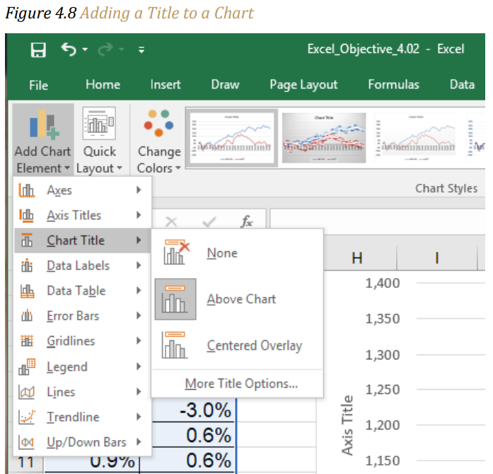
8. Click the Design tab in the Chart Tools section of the Ribbon.
9. Click the drop-down next to the Add Chart Element. Select Chart Title from the dropdown list. Chart. Because there is a lot of white space above the line chart we will select the Above Chart option from the drop-down list (see Figure 4.8 “Adding a Title to a Chart”). This adds a generic title above the plot area of the chart.
10. While the title box is selected, click in the formula bar and type 52 Week Trend – S&P 500 and Microsoft Comparison, alt Enter to add a new row to the chart title and then type June 2016 – June 2017. When you hit enter the new chart title will appear in the Chart Title box.
11. To reposition the X axis labels so that the trend lines are not over lapping the axis and hiding the weeks, click anywhere on the weeks to activate the X axis. Right click and select Format Axis from the drop-down menu. Click on Labels, then Label Position. Choose Low to position the weeks below the lowest value in the chart.
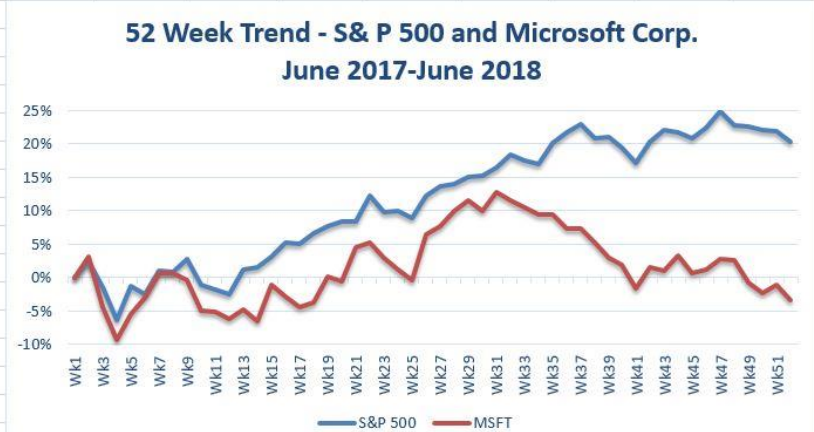
Figure 4.9 “Final Trend Comparison Line Chart” shows that Microsoft has not performed as well as the S&P 500 benchmark. From week 31 to week 52, Microsoft is showing a significant decline compared to the S&P 500, which continues to grow. What makes this chart effective is that an audience can quickly see how Microsoft compares with the S&P 500 over the 52-week period.
Figure 4.9 Final Trend Comparison Line Chart
Integrity Check – Comparing Trends with Incompatible Values
When creating a chart to compare the trends of two or more data series, the values for
each data series must be compatible. In other words, the values for each data series
must be within a reasonable range for an effective comparison to be made. If the
variance between the values in your data series is never less than a multiple of 2 (i.e.,
500 × 2 = 1000 or 1000 ÷ 2 = 500), calculate the percent change for each point in time
on your worksheet. The percent change must be calculated with respect to the first data
point for each series. Then create your chart using the percentages instead of the actual
values for each data series.
Column Chart 1: Frequency Distribution
Follow-along file: Continue with Excel Objective 4.00. (Use file Excel Objective 4.03 if starting here.)
A professor at the school wants to chart the performance of his students in his class based on the grades earned during the class. He decides to use a column chart to show the results because column charts are typically used to compare several items, (in this case the grade distribution,) over a specific range of values, (the number of students in his class.). Column charts should be used when comparing a single category of data between individual subitems.
In column charts, categories are typically organized along the horizontal axis and values along the vertical axis. For example, in Chapter 1 “Fundamental Skills” we showed a sales trend over a twelve-month period.
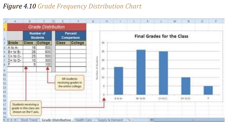
Another common use for column charts is frequency distributions. A frequency distribution shows the number of occurrences by established categories. For example, a common frequency distribution used in most academic institutions is a grade distribution. A grade distribution shows the number of students that achieve each level of a typical grading scale (A, A−, B+, B, etc.). The Grade Distribution worksheet contains the final grades for the professor’s academic class. To show the grade frequency distribution, the numbers of students appear on the Y axis and the grade categories appear on the X axis. The following steps explain how to create this chart:
1. Highlight the range A3:B8 on the Grade Distribution worksheet. Column B shows the number of students that achieved a grade within the grade category shown in Column A.
2. Click the Column button in the Charts group section on the Insert tab of the Ribbon. Select the first format from the drop-down list of options, which is the Clustered Column format.
3. Click and drag the chart so the upper left corner is in the middle of cell H2.
4. Resize the chart so the left side is locked to the left side of Column H, the right side is locked to the right side of Column P, the top is locked to the top of Row 2, and the bottom is locked to the bottom of Row 16.
5. From the Chart Tools Design ribbon add a Y axis title to explain what the Y axis is referring to. Click the drop-down arrow next to Add a Chart Element and select Axis Titles, then select Primary Vertical Axis. While the axis title is still selected, click in the Formula bar and type Number of Students. Then click Enter.
6. Click the title of the chart to activate the title box.
7. In the formula bar type the following in front of the word Class: Final Grades for the Class.
8. Click any cell location on the Grade Distribution worksheet to deactivate the chart.
Figure 4.10 “Grade Frequency Distribution Chart” shows the completed grade frequency distribution chart. By looking at the chart, you can immediately see that the greatest number of students earned a final grade in the B+ to B− or the C+ to C− categories.
Column Chart vs. Bar Chart
When using charts to show frequency distributions, the difference between a column
chart and a bar chart is really a matter of preference. Both are very effective in showing
frequency distributions. However, if you are showing a trend over a period of time, a
column chart is preferred over a bar chart. This is because a period of time is typically
shown horizontally, with the oldest date on the far left and the newest date on the far
right. Therefore, the descriptive categories for the chart would have to fall on the X axis,
which is the configuration of a column chart. On a bar chart, the descriptive categories
are displayed vertically along the Y axis.
Moving a Chart to a Chart Sheet
Follow-along file: Continue with Excel Objective 4.00. (Use file Excel Objective 4.04 if starting here.)
The charts we have created up to this point have been added to, or embedded in, an existing worksheet. Charts can also be placed in a dedicated worksheet called a chart sheet. It is called a chart sheet because it can contain only an Excel chart. Chart sheets are useful if you need to create several charts using the data in a single worksheet. If you embed several charts in one worksheet, it can be cumbersome to navigate and browse through the charts. It is easier to browse through charts when they are moved to a chart sheet because a separate sheet tab is added to the workbook for each chart. The following steps explain how to move the grade frequency distribution chart to a dedicated chart sheet:
1. Click anywhere on the Final Grades for the Class chart on the Grade Distribution worksheet.
2. Click the Move Chart button in the Design tab of the Chart Tools set of commands. This opens the Move Chart dialog box. You can use this dialog box to move the chart to a different worksheet or create a dedicated chart sheet.
3. Click the New sheet option on the Move Chart dialog box.
4. The entry in the input box for assigning a name to the chart sheet tab should automatically be highlighted once you click the New sheet option (see Figure 4.11 “Moving a Chart to a Chart Sheet”). Type Class Grades. This replaces the generic name in the input box.
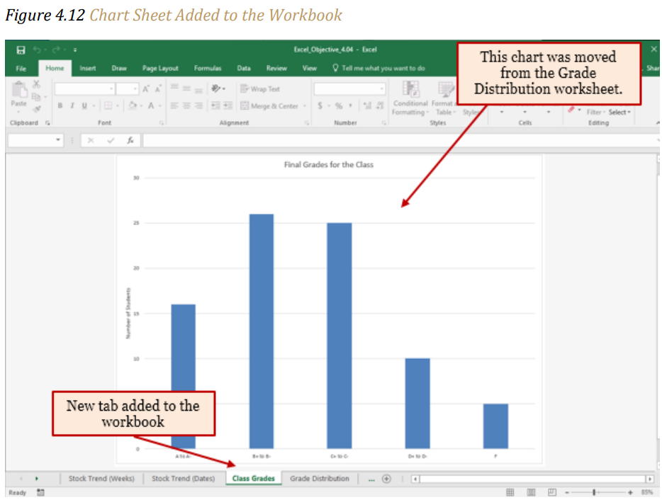
5. Click the OK button at the bottom of the Move Chart dialog box. This adds a new chart sheet to the workbook with the name Class Grades.
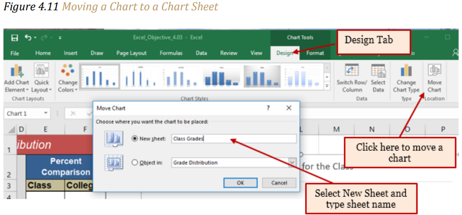
Figure 4.12 “Chart Sheet Added to the Workbook” shows the Final Grades for the Class column chart in a separate chart sheet. Notice the new sheet tab added to the workbook matches the tab name entered into the Move Chart dialog box. Since the chart is moved to a separate chart sheet, it no longer is displayed in the Grade Distribution worksheet.
Clustered Column Chart: Frequency Comparison
Follow-along file: Continue with Excel Objective 4.00. (Use file Excel Objective 4.05 if starting here.)
Next, the professor would like to see how the students in his class students compared to all the students taking the course at the school. We will create a second column chart to show a comparison between two frequency distributions. Column C on the Grade Distribution worksheet contains data showing the number of students who received grades within each category for the entire college. We will use a clustered column chart to compare the grade distribution for the class (Column B) with the overall grade distribution for the college (Column C).
However, since the number of students in the class is significantly different from the total number of students in the college, we must calculate percentages to make an effective comparison. The following steps explain how to calculate the percentages:
1. Highlight the range B9:C9 on the Grade Distribution worksheet.
2. Click the AutoSum button in the Editing group of commands on the Home tab of the Ribbon. This automatically adds SUM functions that sum the values in the range B4:B8 and C4:C8.
3. Activate cell E4 on the Grade Distribution worksheet.
4. Enter a formula that divides the value in cell B4 by the total in cell B9. Add an absolute reference to cell B9 in the formula =B4/$B$9.
5. Copy the formula in cell E4 and paste it into the range E5:E8 using the Paste Formulas command.
6. Activate cell F4 on the Grade Distribution worksheet.
7. Enter a formula that divides the value in cell C4 by the total in cell C9. Add an absolute reference to cell C9 in the formula =C4/$C$9.
8. Copy the formula in cell F4 and paste it into the range F5:F8 using the Paste Formulas command.
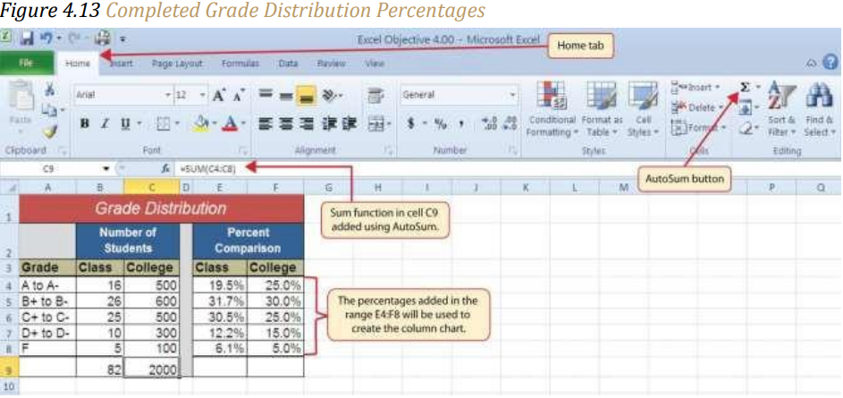
Figure 4.13 “Completed Grade Distribution Percentages” shows the completed percentages added to the Grade Distribution worksheet. The column chart uses the grade categories in the range A4:A8 on the X axis and the percentages in the range E4:F8 on the Y axis. Like the trend comparison line chart, this chart uses data that is not in a contiguous range. This method is more cumbersome then the first method presented but provides an excellent learning example of how to edit your chart data. The following steps explain a second method for creating charts with data that is not in a contiguous range:
1. Activate cell H2 on the Grade Distribution worksheet. It is important to note that this is a blank cell that is not adjacent to any data on the worksheet.
2. Click the Insert tab of the Ribbon.
3. Click the Column button in the Charts group of commands. Select the first option from the drop-down list of chart formats, which is the Clustered Column. This adds a blank chart to the worksheet.
4. Click and drag the blank chart so the upper left corner is in the middle of cell H2.
5. Resize the blank chart so the left side is locked to the left side of Column H, the right side is locked to the right side of Column P, the top is locked to the top of Row 2, and the bottom is locked to the bottom of Row 16.
6. Click the Select Data button in the Design tab of the Chart Tools section of the Ribbon. This opens the Select Data Source dialog box.
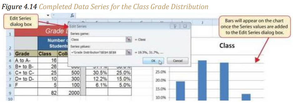
7. Click the Add button on the Select Data Source dialog box. This opens the Edit Series dialog box.
8. In the Series name input box on the Edit Series dialog box, type the word Class.
9. Press the TAB key on your keyboard to advance to the Series values input box on the Edit Series dialog box.
10. Highlight the range E4:E8 on the Grade Distribution worksheet. This automatically adds the range to the Series values input box. You also see bars added to the column chart (see Figure 4.14 “Completed Data Series for the Class Grade Distribution”).
11. Click the OK button on the Edit Series dialog box.
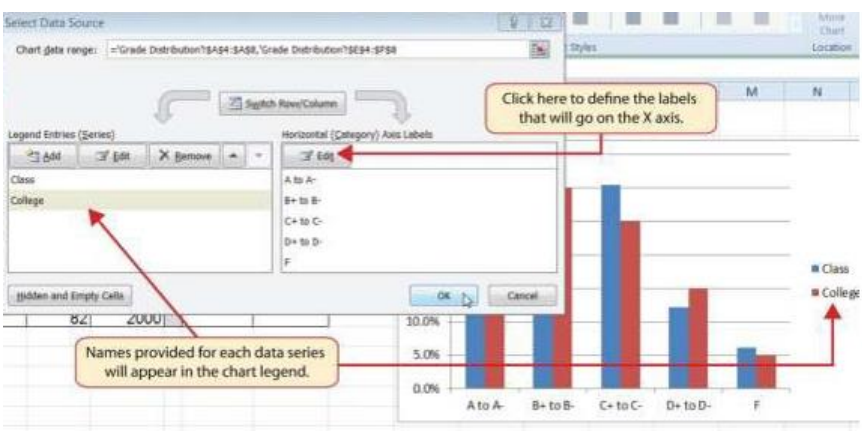
12. Click the Add button on the Select Data Source dialog box.
13. In the Series name input box on the Edit Series dialog box, type the word College.
14. Press the TAB key on your keyboard to advance to the Series values input box on the Edit Series dialog box.
15. Highlight the range F4:F8 on the Grade Distribution worksheet. This automatically adds the range to the Series values input box. You also see bars added to the column chart.
16. Click the OK button on the Edit Series dialog box.
17. Click the Edit button on the right side of the Select Data Source dialog box under the Horizontal (Category) Axis Labels section. This is used to define the labels that will appear on the X axis of the chart and opens the Axis Labels dialog box.
18. Highlight the range A4:A8 on the Grade Distribution worksheet. This adds the range to the Axis Labels dialog box, and the labels appear on the X axis on the column chart (see Figure 4.15 “Final Settings for the Select Data Source Dialog Box”).
19. Click the OK button on the Axis Labels dialog box.
20. Click the OK button on the Select Data Source dialog box.
Figure 4.15 Final Settings for the Select Data Source Dialog Box
21. Click the drop-down next to the Add Chart Element. Select Chart Title from the dropdown list. Chart. Because there is a lot of white space above the line chart we will select the Above Chart option from the drop-down list (see Figure 4.8 “Adding a Title to a Chart”). This adds a generic title above the plot area of the chart.
22. Click in the text box containing the chart title. Delete the generic chart title and replace it with the following: Grade Distribution Comparison.
23. From the Add Chart Element drop-down, select Legend, Bottom. This places the legend below the chart which does not compress the chart size as much as if it were placed on the sides.
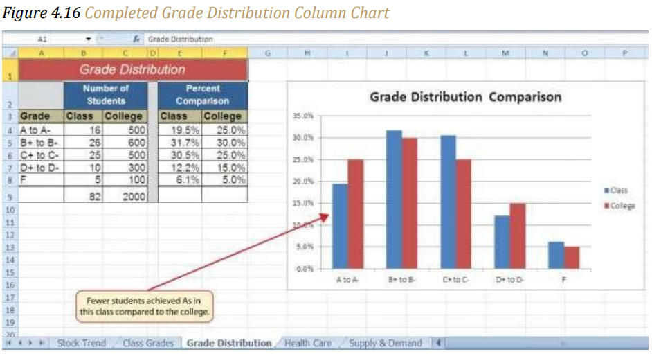
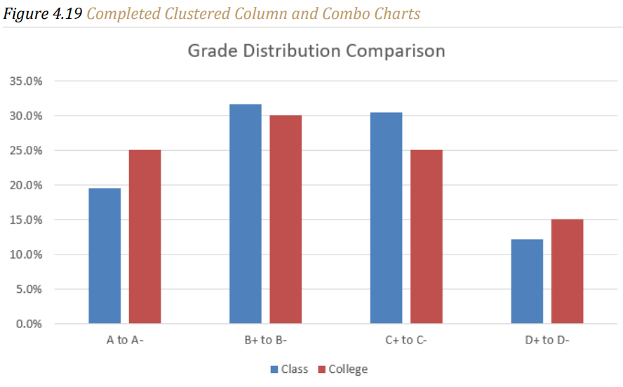
Figure 4.16 “Completed Grade Distribution Column Chart” shows the final appearance of the clustered column chart. The clustered column chart is an appropriate type for this data because there are fewer than twenty data points and we can easily see the comparison for each category. An audience can quickly see that the class issued fewer A’s compared to the college. However, the class had more B’s and C’s compared with the college population.
Selecting Non-Contiguous Ranges:
The previous steps walked you through how to create a chart “from scratch” by building all the data series within the Select Data Source dialog box. A quicker method to build a chart using non-contiguous ranges is to select the first range, typically the row with labels, hold down the Ctrl key and select any other cells you want to chart.

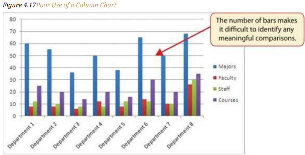
Integrity Check – Too Many Bars on a Column Chart?
Although there is no specific limit for the number of bars you should use on a column
chart, a general rule of thumb is twenty bars or less. Figure 4.17 “Poor Use of a Column
Chart” contains a total of thirty-two bars. This is considered a poor use of a column chart
because it is difficult to identify meaningful trends or comparisons. The data used to
create this chart might be better used in two or three different column charts, each with a
distinct idea or message.
Combo Chart: Non-comparative values
Follow-along file: Continue with Excel Objective 4.00. (Use file Excel Objective 4.06 if starting here.)
Remember, when building the second frequency chart above we created percentages to create a chart that had comparative value. However, we do have a chart type that can take disparate values like those of comparing a class to the college as a whole. This chart is the Combo chart. It uses both columns and lines to display data in such a way that it can be meaningful. The combo chart uses the vertical Axis to convey meaning to the data being presented. We will create a Combo chart to show a comparison between two frequency distributions. Column C on the Grade Distribution worksheet contains data showing the number of students who received grades within each category for the entire college. We will use a column chart to compare the grade distribution for the class (Column B) with the overall grade distribution for the college (Column C).
However, since the number of students in the class is significantly different from the total number of students in the college, we will make the class grades a column chart and the college grades a line chart. The steps to do this are:
1. On the Grade Distribution worksheet, highlight the range B3:C8
2. From the Insert ribbon click on Recommended Charts, then select the All Charts tab, and then Combo Chart.
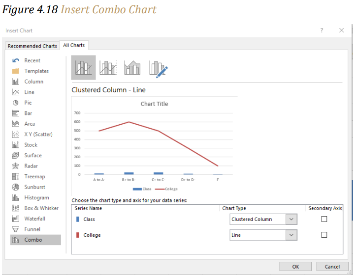
3. You’ll notice that our chart example looks a bit strange. We need to define which series will be the line and which will be the clustered column. We will take the default selected here, but the chart types can be change by using the drop-down next to each chart type.
4. Next, we need to tell Excel which series we want to be our secondary vertical axis. The values for this axis will show on the left side of the chart and the values for the primary will show on the right. We will select the line chart to be our secondary axis.
5. You will see the chart example change so that now there is a meaningful chart showing. Click the OK button.
6. Next, we will put in our vertical axis titles so the chart is easier to read. From the Chart Tools Design ribbon, Add Chart Element, select Axis Titles and Primary Vertical Axis.
7. With the Axis Title box active, type Class Students in the Formula bar and hit Enter.
8. Now we will add the secondary vertical axis following the same steps above, excepting selecting Secondary Vertical Axis.
9. With the Axis Title box active, type College Students in the Formula bar and hit Enter.
10. We will rotate the College Students axis label by going to the Home ribbon and in the Alignment section rotate the text down.


Pie Chart: Percent of Total
Follow-along file: Continue with Excel Objective 4.00. (Use file Excel Objective 4.07 if starting here.)
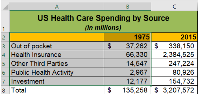
The Health Care worksheet contains data that shows total spending in the United States for the years 1975 and 2015. In 1975, the total amount spent in the United States for health-related expenses was over $135 billion. The total amount spent in 2015 was over $3.2 trillion.
The next chart we will demonstrate is a pie chart. A pie chart is used to show a percent of total for a data set at a specific point in time. In the case of our health care data, you can choose either the 1975 data, the 2015 data, or the total spent for the two time periods. You cannot use a pie chart to chart all three columns.
The data we will use to demonstrate a pie chart is related to the overall spending activity in the health-care industry for 1975. The pie chart shows how this $135 billion was funded. The following steps explain how to accomplish this:
1. Highlight the range A2:B7 on the Health Care worksheet.
2. Click the Insert tab of the Ribbon.
3. Click the Pie button in the Charts group of commands.
4. Select the “3-D Pie chart” option in the middle section of drop-down list of options.
5. Click and drag the pie chart so the upper left corner is in the middle of cell E2.
6. Resize the pie chart so the left side is locked to the left side of Column E, the right side is locked to the right side of Column M, the top is locked to the top of Row 2, and the bottom is locked to the bottom of Row 17 (see Figure 4.18 “Pie Chart Moved and Resized”).

7. Click the chart legend once and press the DELETE key on your keyboard. A pie chart typically shows labels next to each wedge. Therefore, the legend is not needed.
8. Click the Add Chart Element button on the Design tab of the Chart Tools section of the Ribbon and select Data Labels from the drop-down list.
9. Select More Data Label Options from the drop-down list. This opens the Format Data Labels dialog box.
10. Click the box next to the Value option under the Label Options section in the Format Data Labels dialog box. This removes the check mark.
11. Click the Percentage option under the Label Options section in the Format Data Labels dialog box. A green check should appear in the box next to this option.
12. Click the Category Name option under the Label Options section in the Format Data Labels dialog box. A check should appear in the box next to this option.
13. Click the Close button at the top of the Format Data Labels dialog box.
14. Click the Home tab of the Ribbon and then click the Bold button. This should bold the data labels on the pie chart.

15. This is looking better, but some of our data labels are overlapping. We will correct that by rotating our 3-D chart. While the chart is still selected, right click and select 3-D rotation from the drop-down menu. Note: Only 3-D charts can be rotated.

16. From the 3-D Rotation format area, rotate the X rotation by 180 degrees. Close the Format Chart Area options.
17. Make the chart title active by clicking on the 1975.
18. Click in front of the year 1975 and type Health Care Spending by Source.
Figure 4.20 “Final Health Care Pie Chart” shows the completed pie chart. You can quickly see that Health Insurance and Out of Pocket made up the majority of health-care spending in 1975. Like the column chart, the key to creating an effective pie chart is the number of categories presented on the chart.
Although there are no specific limits for the number of categories you can use on a pie chart, a good rule of thumb is ten or less. As the number of categories exceeds ten, it becomes more difficult to identify key categories that make up the majority of the total. In this example, it is easy to see that two categories compose 75% of the total.

Skill Refresher – Inserting a Pie Chart
1. Highlight a range of cells that contain one set of data you will use to create the chart.
2. Click the Insert tab of the Ribbon.
3. Click the Pie button in the Charts group.
4. Select a format option from the Pie Chart drop-down menu.
Stacked Column Chart: Percent of Total Trend:
Follow-along file: Continue with Excel Objective 4.00. (Use file Excel Objective 4.07 if starting here.)
The last chart type we will demonstrate is the stacked column chart. We use a stacked column chart to show how a percent of total changes over time. For example, the data on the Health Care worksheet shows spending by source for 1975 and 2015. A stacked column chart can show whether there is any change in the percent of total for each source between the two years. Remember that with a pie chart we are limited to one data series only. In a stacked column chart, we can have multiple data series and use them for comparative purposes.
On the stacked column chart the Y axis of the chart shows the percentage from 0% to 100%. The X axis shows the two years: 1975 and 2015. The following steps explain how to create this chart:
1. Highlight the range A2:C7 on the Health Care worksheet. Note: never include the total row or column unless that is the only data you are charting.
2. Click the Insert tab of the Ribbon.
3. Click the Column button in the Charts group of commands. Select the 100% Stacked Column format option from the drop-down list (see Figure 4.21 “Selecting the 100% Stacked Column Format”).
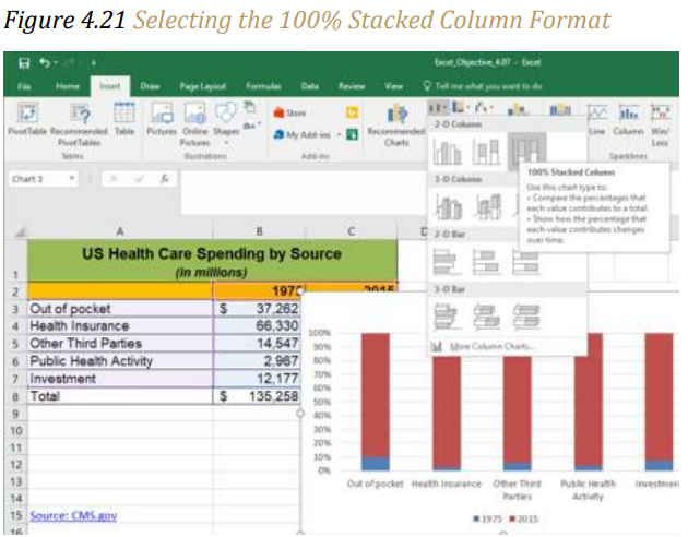
Figure 4.22 “Initial Construction of the 100% Stacked Column Chart” shows the column chart that is created after selecting the 100% Stacked Column format option. As mentioned, the goal of this chart is to show the percentages on the Y axis and the years 1975 and 2015 on the X axis. However, notice that Excel places the spend sources on the X axis. The remaining steps explain how to correct this problem and complete the chart:
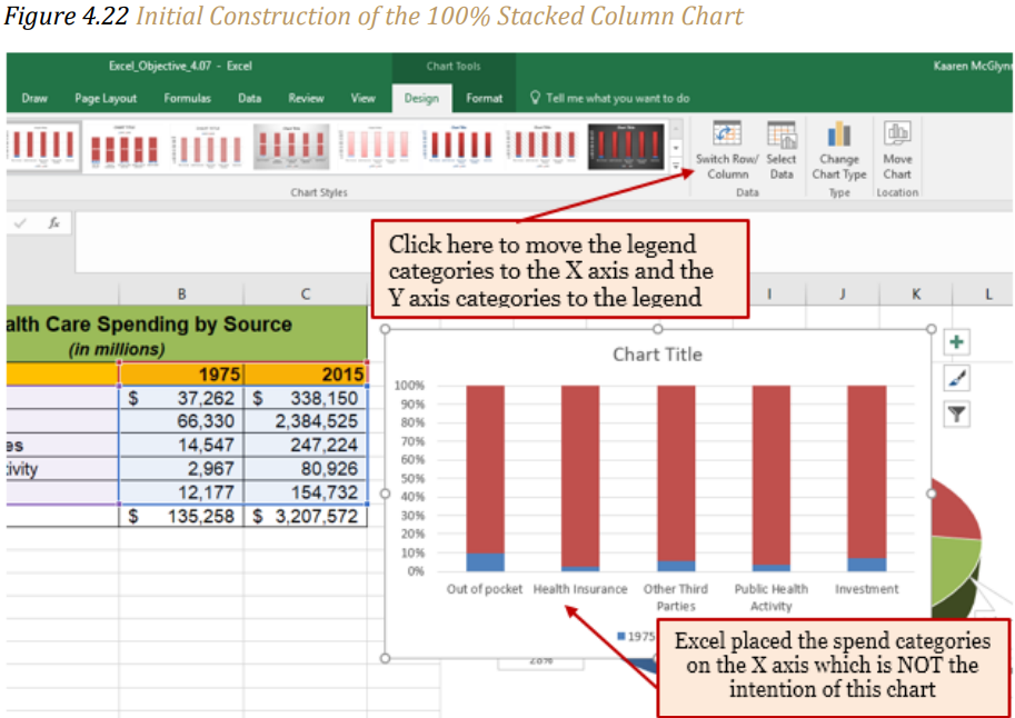
4. Click the Switch Row/Column button in the Design tab on the Chart Tools section of the Ribbon. This reverses the legend and current X axis categories.
5. Click and drag the chart so the upper left corner is in the middle of cell E19.
6. Resize the chart so the left side is locked to the left side of Column E, the right side is locked to the right side of Column N, the top is locked to the top of Row 19, and the bottom is locked to the bottom of Row 37.
7. Click the legend one time and press the DELETE key on your keyboard.
8. Click the Layout tab on the Chart Tools section of the Ribbon.
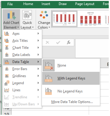
9. Click the Add Chart Element and select Data Table with Legend Keys option from the drop-down menu. This is another way of displaying a legend for a column chart along with the numerical values that make up each component. Note: It is generally better to not include the data table in your charts as it clutters more than helps. In this example, it is appropriate.
10. Click in the chart title button in the Layout tab of the Chart Tools section of the Ribbon.
11. Select the Above Chart option for the drop-down menu.
12. Click the chart title two times. Delete the generic chart title name and type Change in Health Care Spend Source.
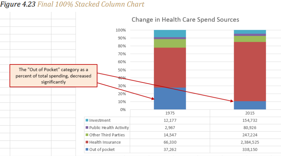
Figure 4.23 “Final 100% Stacked Column Chart” shows the final stacked column chart. Notice that the Out-of-Pocket category, or the amount of cash people paid for health-care expenses, decreased significantly from 1975 to 2015. However, the Health Insurance category increased significantly from 1975 to 2015.
Overall, the chart shows that the total out-of-pocket and health insurance expense increased significantly from 1975 to 2015. These two categories made up approximately 77% of total health-care spending in 1975. By 2015, these two categories increased to over 85% of total health-care spending.
Skill Refresher – Inserting a Stacked Column Chart
1. Highlight a range of cells that contain data that will be used to create the chart.
2. Click the Insert tab of the Ribbon.
3. Click the Column button in the Charts group.
4. Select the Stacked Column format option from the Column Chart drop-down menu to
show the values of each category on the Y axis. Select the 100% Stacked Column
option to show the percent of total for each category on the Y axis.
Key Takeaways
- Identifying the message you wish to convey to an audience is a critical first step in
creating an Excel chart. - Both a column chart and a line chart can be used to present a trend over a period of
time. However, a line chart is preferred over a column chart when presenting data
over long periods of time. - The number of bars on a column chart should be limited to approximately twenty bars or less.
- For column, line, and bar charts, the X axis can be used only for labels, not for numeric values. The exception is dates in the X axis.
- When creating a chart to compare trends, the values for each data series must be within a reasonable range. If there is a wide variance between the values in the two-data series (two times or more), the percent change should be calculated with respect to the first data point for each series, or use a Combo chart.
- When working with frequency distributions, the use of a column chart or a bar chart is a matter of preference. However, a column chart is preferred when working with a trend over a period of time.
- A pie chart is used to present the percent of total for a single data set.
- A stacked column chart is used to show how a percent total changes over time.
